When providing analytic reports to Senior Management, there are many approaches that can be taken to create these necessary building blocks for Business Intelligence. Before we show you suggested building blocks, let’s break down the terminology. The term Business Intelligence (BI) refers to technologies, applications, and practices for the collection, integration, analysis, and presentation of business information. The purpose of Business Intelligence is to support better business decision making. Aqua Data Studio helps the user get to the collections of data no matter where these collections are stored. This data could exist in the cloud, in relational databases, in document stores, or applications like Excel spreadsheets. These collections can then be analyzed in a clear and concise manner. These presentations of the business information can then be saved or shared. This blog’s approach assumes the user is a Data Analyst and does not know much about the data or Aqua Data Studio.
In order to get started, there are a few questions that need to be answered in preparation for building these blocks.
- What business case or cases are we trying to collect data for?
- Where are we getting the data from?
- How do we want to present that data?
- How do we want to share the results?
Examples
In this example, sales data for a bike shop is used. We would like to see the profit by product data and present these results in a bar chart to be shared in an image, using Aqua Data Studio. At the end of the building blocks, I have attached a video for this example along with more ideas and an execution for building these blocks using Aqua Data Studio.
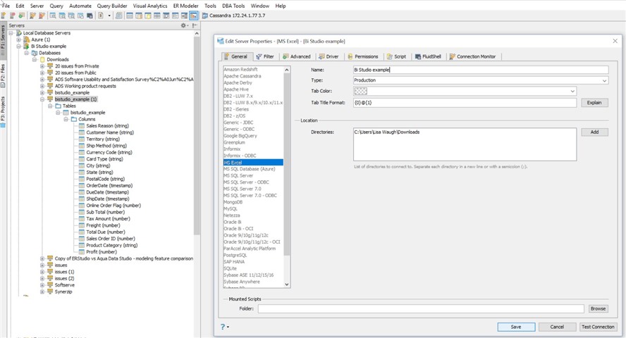
- Connect to a data source; in this example, my data source is an Excel file (BIexample.xls).
Figure 1:
- Create a query to extract the data you need using Aqua Data Studio’s Query Builder. There are a couple of ways of doing this:
- Drag the table over to the white space; right click on the tables and select Query Builder
- Open the Query Analyzer window then write a select statement.
Note: dragging or right clicking is for users unfamiliar with writing queries and is used in our example because, as stated previously, this user is not familiar with Aqua Data Studio and writing queries.
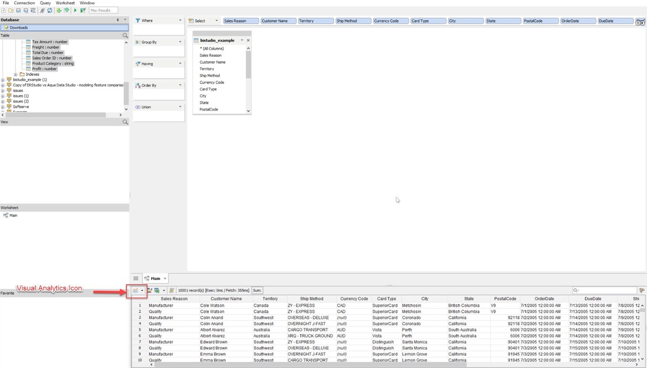
Notice the data is now populated with the data grid at the bottom of the screen shown in Figure 2. We can now verify the data again here if necessary.
Figure 2:
Now that we have the data we are going to work with, we will select Aqua Data Studio’s Visual Analytics feature. There are a few ways of doing this:
- Select the menu item, Visual Analytics’ New
- Cut and paste the data set from memory
- Click the icon on the data grid that is highlighted in red in Figure 2.
The great thing about Aqua Data Studio’s Visual Analytics is that it automatically reads the data and classifies it in dimensions and measures. Because the data is parsed and ready, we just need to select the graphical representation of our choosing for Visual Analytics.
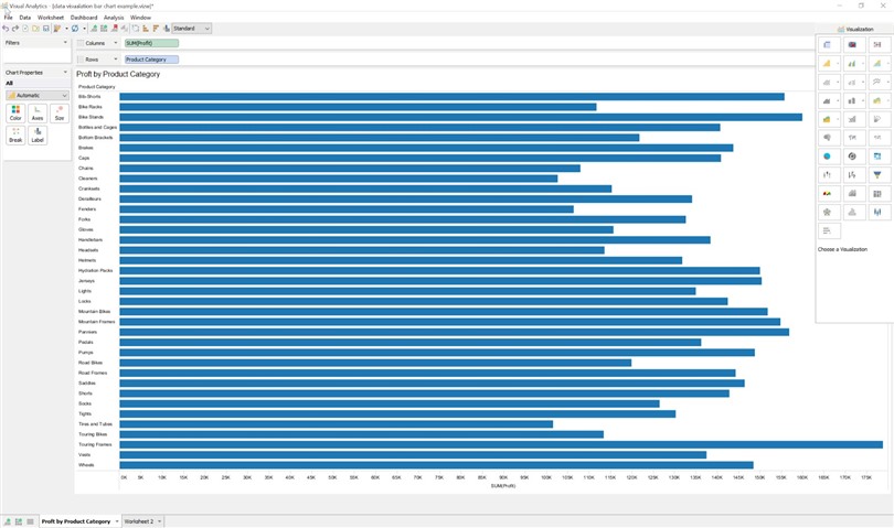
- We then need to get our profit data to display, by dragging Profit onto the Columns deck and Product Category onto the Rows deck. As you can see, I used the bar charts in Figure 3 to display the data.
Figure 3:
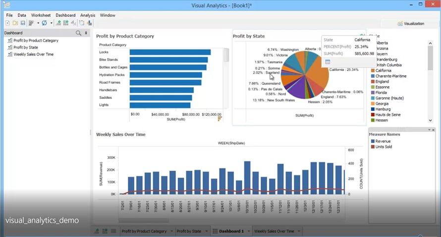
Visual Analytics supports many different chart types, such as Pie chart, Line chart, and Area chart just to name a few, and provides extensive configuration options so that you can present the reports exactly the way you want them. You can also combine several worksheets into a dashboard. See Figure 4 for different views; this is directly from the link to the Demo provided.
- There are a couple of ways that you can share the result.
- Save your results as a packaged workbook, which contains both workbook data as well as the data extract. This can be shared with anyone who also has access to Aqua Data Studio.
- Another way is to export the worksheets or dashboards. Click on File, Export to start the export process. From here you can choose to export the current sheet, all sheets, or a list of selected sheets. There are some options for file format: Image, HTML, PDF, and Excel (tables only). For the purposes of this example, we are going to export as an image. You can also choose whether to export the size, shape, and color legends, and their layout options. Click Next and choose where you want to save the export to. The saved export can be viewed in a viewer, or it can be sent to others. This is very useful as you can save the file on a network drive, cloud, or cell phone for sharing.
Figure 4:
We have now created a worksheet with Profit by Product data that can be used in a nice presentation to our management team. If you would like to learn more about these building blocks and more, please watch this Visual Analytics Demo video for a walk through of Visual Analytics using Aqua Data Studio.


