Disseminating accurate and understandable information is a crucial part of any strategy to fight the novel coronavirus and help control its spread. Knowledge is power and that fact is never more important than when lives are on the line. Making decisions using inaccurate data is dangerous and can result in furthering the scope of the pandemic. So using verifiable data that is backed by facts is the crucial first step when communicating with the public regarding COVID-19.
The second critical component that needs to be considered when presenting information to the general population is that it is easily understandable by everyone. Providing the most compelling evidence for a particular viewpoint is pointless if no one in the audience gets the point. In the battle against COVID-19, not getting the point can lead to extremely serious consequences.
The concept of data visualization is very simple. It takes advantage of the human brain’s capacity to efficiently process and understand information that is presented visually. Data visualization takes a bunch of numbers and develops informative pictures from them. These numbers are usually statistical and describe the same information contained in the visualization. The difference is the data is more accessible and persuasive in its visual form. Again, when talking about information about the coronavirus, this difference can potentially save lives.
Visualization in Action
Governments, scientists, and medical professionals are all making use of data visualization to better understand the virus and convey their knowledge to the world’s concerned citizens. The information about the virus is numerical with statistics on case counts, mortality, and testing rates being among the data items of interest. This type of data lends itself to expression through visualization.
Here are some examples of how data visualization is being used to help society cope with this unprecedented pandemic.
- The Washington Post has an informative webpage that visually presents information detailing how the virus spreads throughout the population. Through data modeling and simulation, viewers can see how COVID-19 affects communities in different ways based on the social distancing policies implemented. You can see how the spread is dramatically changed when left unchecked versus the effects of a forced quarantine such as that imposed in China or the social distancing adopted in many European countries and the United States. Anyone questioning the need to practice social distancing should take look at these data visualizations.
- Johns Hopkins University is hosting a comprehensive coronavirus visualization that is built on top of a map of the world. Users can view the global spread of the pandemic or focus on specific areas or cities. Data points include those regarding current active cases, case-fatality ratio, testing rate, and the number of hospitalized patients. It is frequently updated and provides an overview of how COVID-19 is affecting large parts of the globe.
- Another graphic that can help inform how decision-makers create social distancing and testing policies can be seen in a graphic that illustrates which countries are flattening the curve of new cases. It provides a time-lapse view of the incidence of cases worldwide and allows users to focus on individual countries or areas of interest. It clearly shows how some nations appear to be controlling the spread of the disease to some extent. One can only hope that the slowdown in new occurrences continues and allows healthcare organizations to keep up with the number of patients.
A Tool for Multi-Platform Data Visualization
The common characteristic shared by these data visualization is that they rely on the information contained in databases as their input. The art of turning that raw information into visual depictions calls for technically advanced software tools. Aqua Data Studio is just such a tool and can be exactly what you need to bring your data to life and present it to the masses.
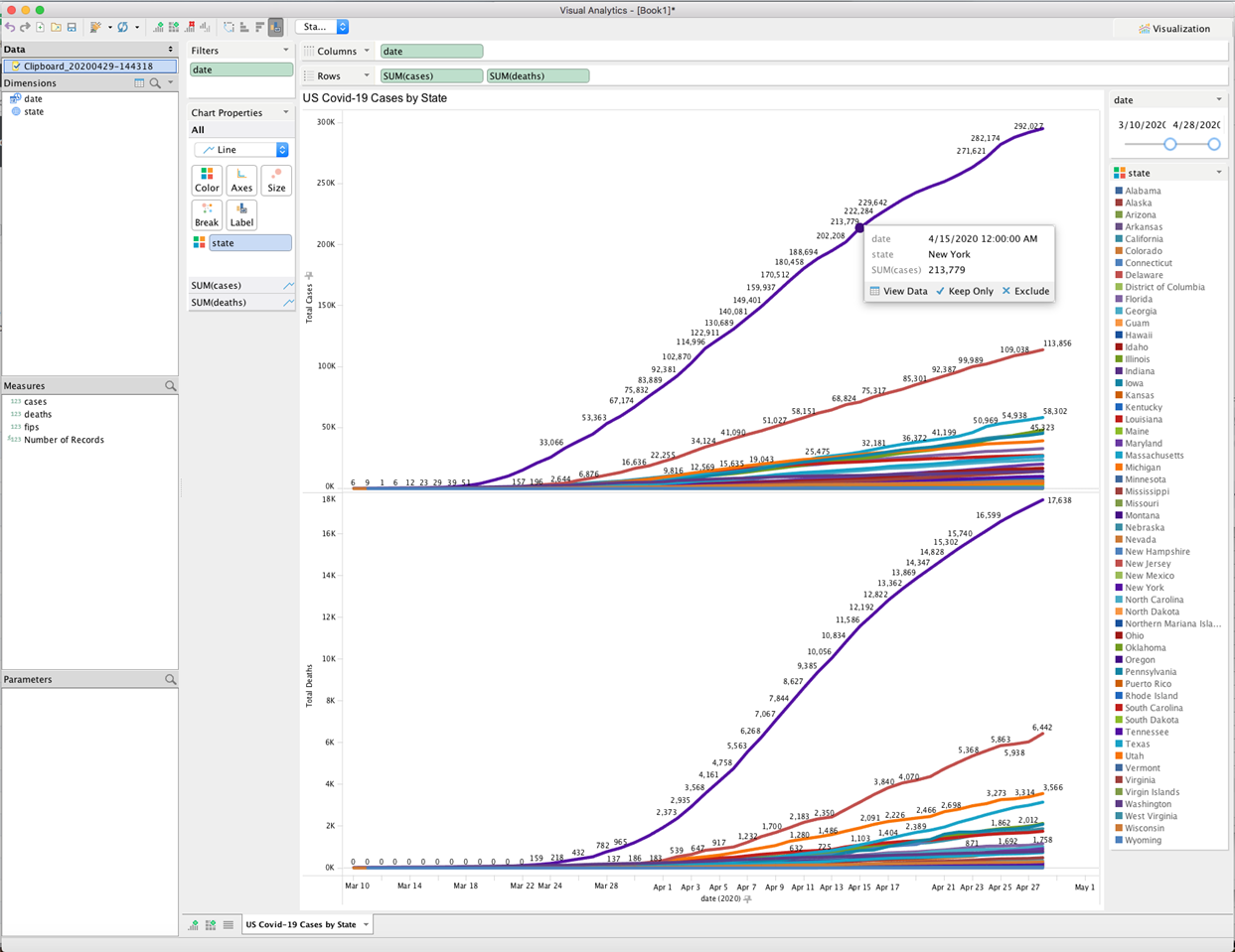
Chart created with Aqua Data Studio visual analytics
Organizations working with healthcare data may need to access many different data sources and repositories. Aqua Data Studio is very versatile and can be run on Windows, Linux or macOS systems while accessing over 40 database platforms. It provides your database team with a drag and drop interface they can use to create informative dashboards and visualizations that make your data speak louder than a page of statistics ever will.
Database professionals are under increased pressure to deliver fast results when working on COVID-19 related issues. The ability to access all of their databases from a single tool adds to their productivity and allows visualizations to easily be developed from the most relevant data sources. It may seem like a minor advantage in the face of the pandemic, but at this point, every little step helps. New insights found through the analysis and visualization of data resources can hold the key to new policies or treatments that minimize the impacts of coronavirus. The importance of using data assets productively and effectively has never been greater.