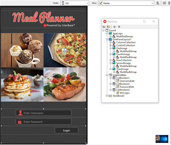
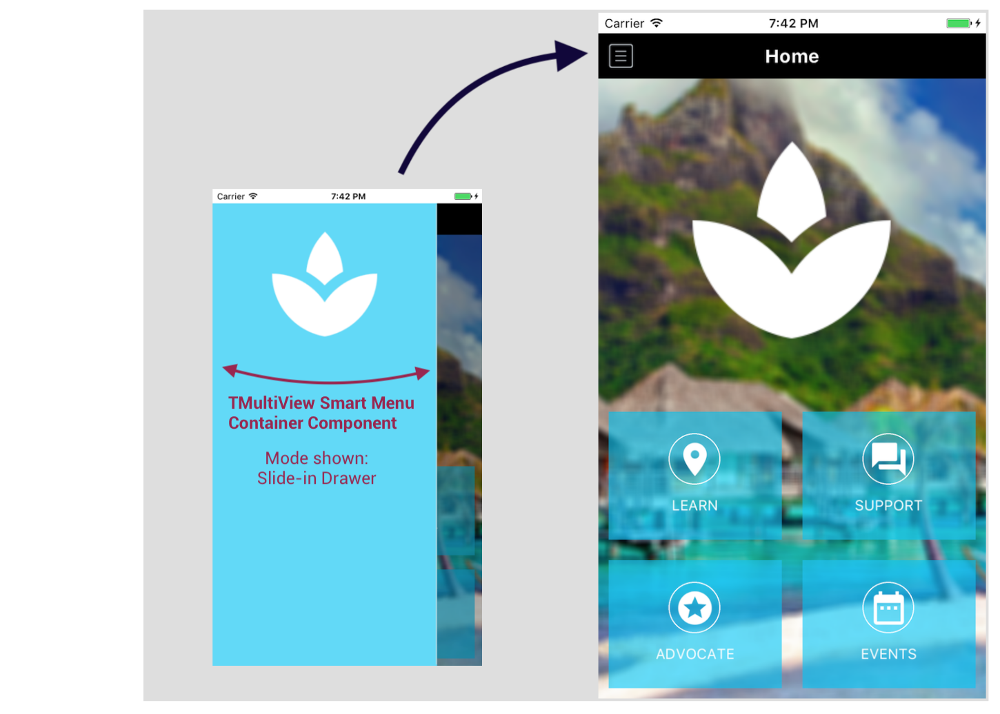
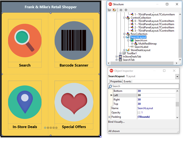
1. Home screens are a popular design paradigm as they display the key app functionality on the first screen, making it easily accessible to the application user. Home Screen navigation usually consists of glyph buttons arranged in a grid like layout and may span over multiple screens. A home screen UI can be easily created in FireMonkey through the use of TabControls, GridPanelLayouts and TLayouts. Check out the Home Screen templates available for download in GetIt.
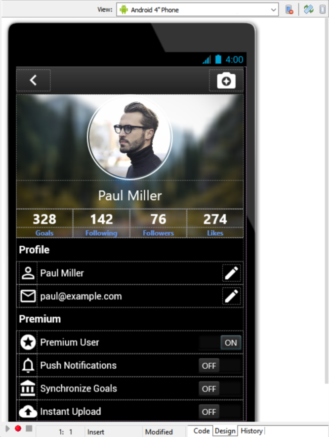
2. Most apps today include a profile screen. Want to add a modern looking profile screen to your app? Add a TCircle to your form with the stroke color set to match the color of your toolbar and a profile photo as the fill. Note: We provide some great profile screen examples in GetIt to help you get started.
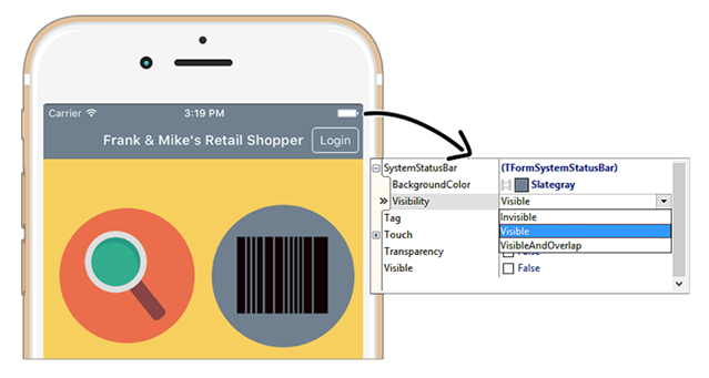
3. On iOS, you can change the behavior of the system status bar through two properties, SystemStatusBar.BackgroundColor and SystemStatusBar.Visibility. This allows you to set the visibility and fill color of the iOS status bar to match your toolbar color.
4. FireUI Multi-Device Designer Tip: If you want the same UI layout across all platforms, you can just work on the Master view without creating device or platform specific views.
5. FireUI Multi-Device Designer Tip: If you want to add iOS specific behavior, you don’t need to create a view for each iOS device, a single view per platform is sufficient.
6. FireUI Multi-Device Designer Tip: The best way to make a common UI change across all created views is by making that change on the Master view.
7. FireUI Multi-Device Designer Tip: The best way to add device specific controls (i.e. only for iPad), is to add those controls on the Master view and then hide them on the iPad (or any other views where they are not needed).
8. FireUI Multi-Device Designer Tip: Changes made on a device specific view are not reflected on other views. In order to see a change reflected on the other views, make the change on the Master or manually edit each view. We recommend using anchors and alignment on the master view as much as possible. Note: You can use the “revert to inherited” option on each view to sync up again with the Master view.
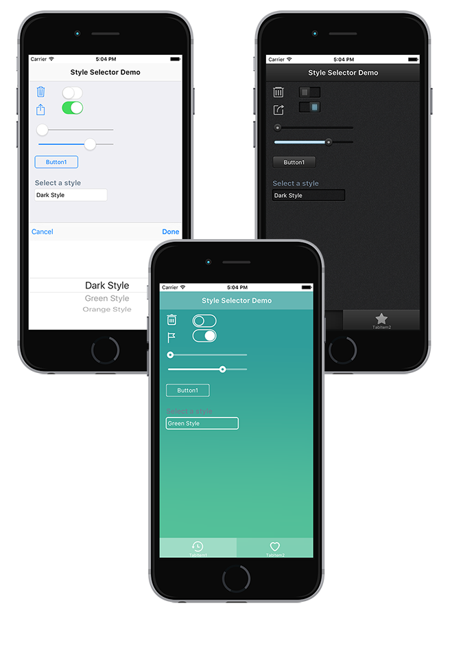
9. FireUI Multi-Device Designer Tip: Adding a style selector to your existing UI is a great way to allow the end user to customize the look and feel of your application. Light and dark themes are popular. Click here for steps.
10. You can customize the look and feel of each FireMonkey control by changing the StyleLookUp property for each control. This applies to the built-in platform styles and custom styles added via TStyleBook.
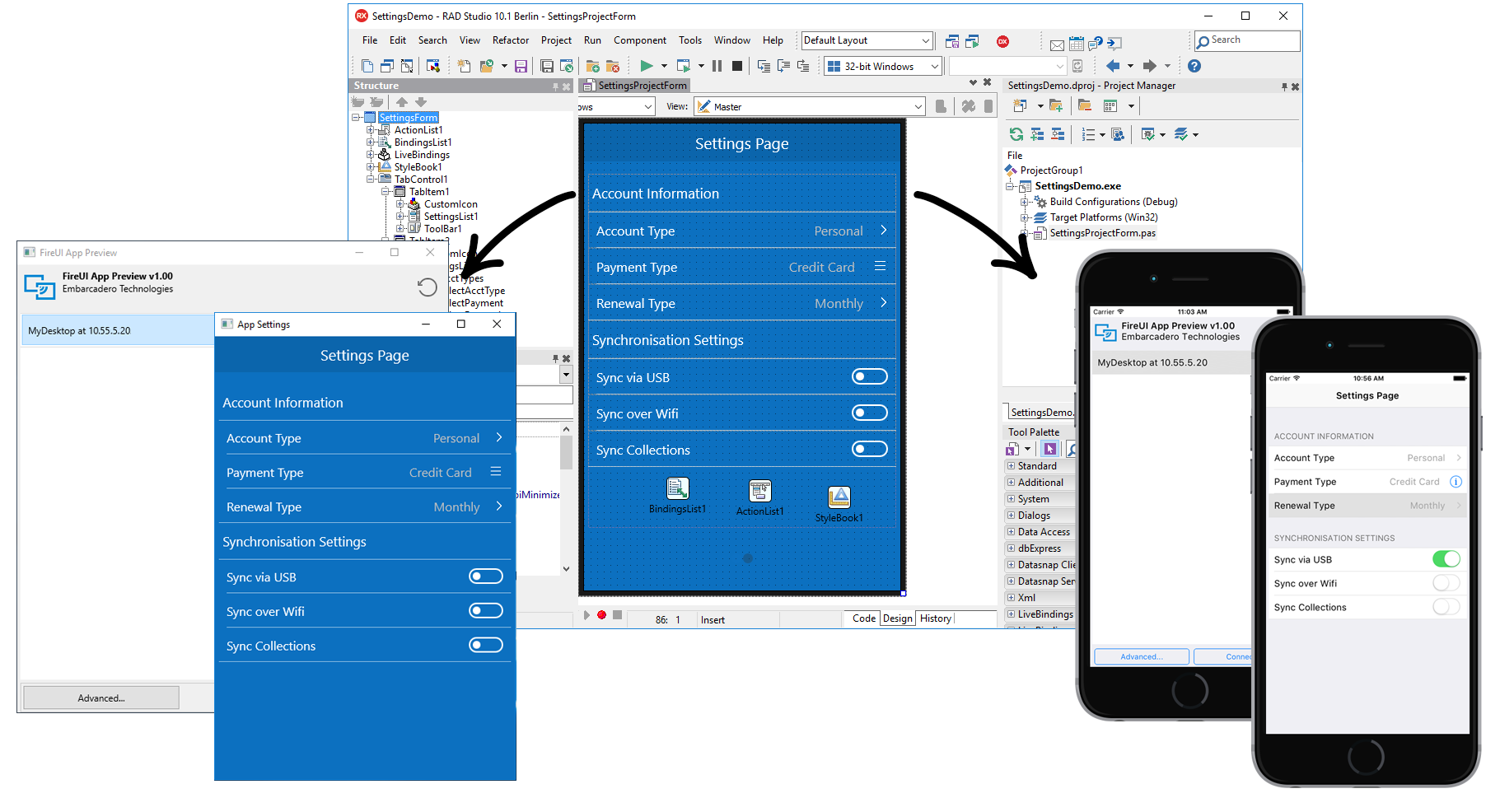
11. Leverage FireUI App Preview to view your FireMonkey application on your iOS, Android, Windows and Mac devices as you are designing the application in the Form Designer. Changes made in the Form Designer are broadcast to connected devices in real time. This feature uses our app tethering functionality as the underlying technology.
12. When designing for iOS use a Segmented Control (using TSpeedButtons) or a ListBox instead of a RadioGroup or RadioButton. RadioButtons can be used on Android
13. The MultiView smart menu component automatically adjusts itself depending on form factor, orientation and target platform using FireMonkey’s built-in behavior services. TMultiView is a container component which means that you can parent many different controls to it. It’s a great component to use for adding a slide-in drawer navigation menu on a phone form factor, and a docked panel on a table.
14. The ListView Item Designer lets you easily design custom ListView layouts for your FMX apps. TListView provides a fast, scrollable list for your multi-device applications. With TListView, you have access to a number of predefined appearance modes that you can choose from. Those appearance modes expose objects that you can then customize and connect to your data source. The Item Designer makes it easy to add additional objects to create custom TListView layouts.
15. The Bitmap Style Designer includes templates for creating your own FireMonkey styles (the Bitmap Style Designer is accessible from the Tools menu in the IDE). This includes style templates for iOS, Android, macOS and Windows.You can easily change the color scheme of one of the templates by exporting the style images as png files, importing them into Photoshop, changing the hue, and then reimporting the updated pngs into the Bitmap Style Designer. In this scenario, you won’t have to make any styled control mapping changes since you didn’t change the shape of the style elements.
16. Building for iOS 13? RAD Studio 10.3.3 includes Dark Theme support for Delphi and C++Builder iOS apps. This includes support for detecting the user’s iOS setting and automatically switching between the dark and light theme without requiring an application restart. Developers can also limit their application UI to just the light theme by adding a new key in Application > Version Info.
17. For developers using components such as TEdit and TSwitch that support native presentation on iOS alongside FMX style rendered controls (using the default platform style), the application UI will automatically get rendered with either the light or dark theme on iOS 13, depending on the end user’s iOS setting.
18. FireMonkey’s built-in behavior service is a service API that allows the framework and developer to query information about the device the app is running on to dynamically adjust itself for the form factor and platform. UI element locations are automatically adjusted for each type of target device. On iOS, tabs are automatically shown at the bottom with icons, whereas on Android they’re displayed at the top without any icons (although icons can be shown if desired), matching the different platform standards.
19. Use the PrototypeBindSource components for fast prototyping with sample data. The LiveBindings Designer makes it really easy to visually bind data to UI controls.
20. When designing a multi-device app, you can create and add new views to the view selector in the Form Designer if the available views do not cover the specifications of your target device. Usually, that is not necessary, but if you want to fine-tune the layout for a specific device (i.e. your company has standardized on a Pixel device), creating a custom view will allow you to further customize your UI.
21. Want to lock your mobile app orientation to Portrait or Landscape? Go to Project > Options > Orientation to enable it.
22. FireMonkey controls allow nesting. Want an image on a button? Just place a TImage on a TButton. Be sure to set the HitTest property on the child TImage to False so the clicks are handled by the parent TButton. Use the ClipChildren property on the TButton to keep the TImage from painting outside the TButton’s boundry. This works for any FireMonkey controls.
23. Want to automatically resize the controls in your user interface? Use the TScaledLayout. Set the Align property to Fit and it will maintain the aspect ratio of the child controls.
24. Padding is the spacing between the children and the edges of the parent. Margins are the spacing between a control and its siblings.
25. The TFlowLayout will automatically reflow the controls it contains like word wrap in a word processor. Use the TFlowLayoutBreak to force a line break in the controls.
