In RAD Studio 10 Seattle, we made many enhancements to the integrated style designer in the IDE. In today's post, I thought I would cover the steps for creating your own custom button style using RAD Studio 10 Seattle. Follow the steps below to create your own custom button style for Windows. The same steps apply to customizing UI controls for other platforms as well.
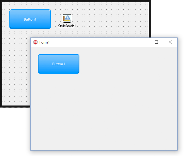
1. Go to File > New > Multi-Device Application to create a new multi-device application
2. Place a TButton onto your form
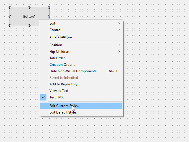
3. Right-click on the control and select "Edit Custom Style …"
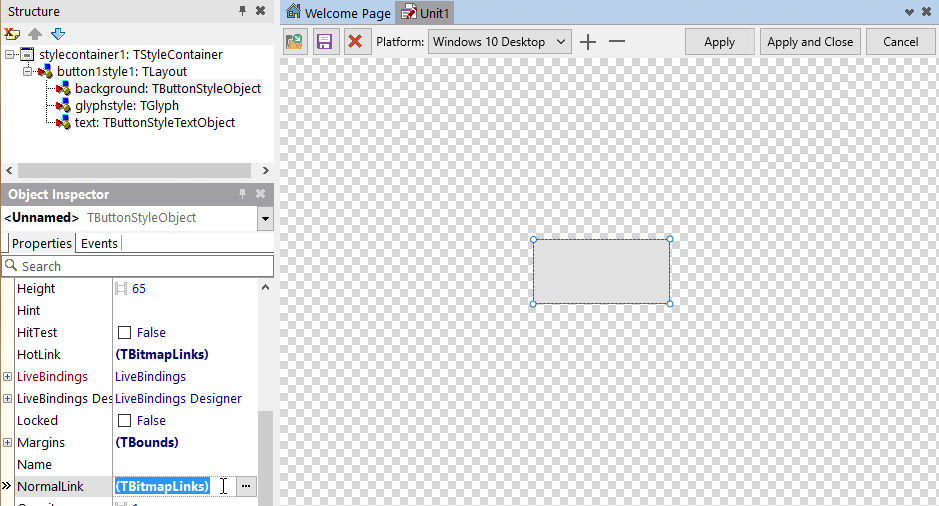
4. Select the "background" object for your selected platform in the new custom style and double-click on the "NormalLink" property in the Object Inspector.
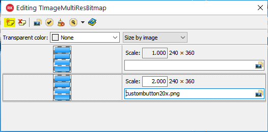
5. In the "BitmapLinks Editor", click on the plus icon to add a new image with your custom graphic for TButton.
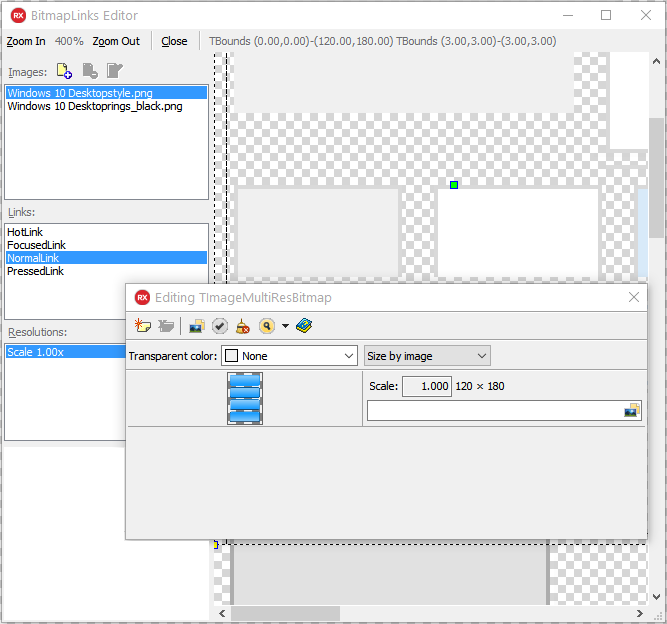
6. Add a new custom button graphic for each resolution that you want to support. For example, if you are building a custom Android style, you should load custom button graphics for "Scale Factor" 1.0, 1.5, 2.0 and 3.0. You can add a new resolution by clicking on the "Add new item" button in the "Editing TImageMultiResBitmap" dialog.
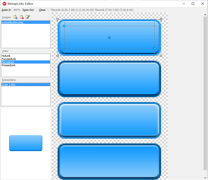
7. In the BitmapLinks Editor, set "NormalLink", "HotLink", "PressedLink" and "FocusedLink" properties for each resolution. Use the outer selection points to define the button state area in your new graphic. Use the inner selection points (marked with blue squares) to define the bitmap margins. Repeat these steps for each of the four "Links", then close the BitmapLinks Editor dialog.
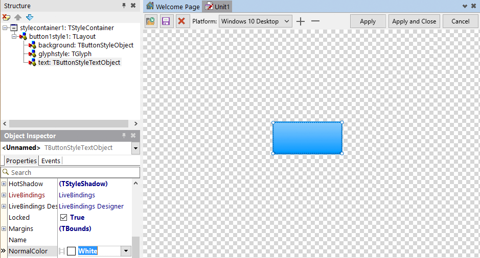
8. Select the "text" object in the Structure pane. Navigate to the Object Inspector and define text colors for "NormalColor", "HotColor", "PressedColor" and "FocusedColor". This allows you to set font colors that work well with your new button graphics.
9. To add a custom style for another platform, click the + button and select the platform style that you want to customize. Repeat the steps outlined in this post to update the graphical elements. Once you are done, click on "Apply and Close" to apply the style changes and close the dialog.
If you want to customize styles for another platform later on, open the Style Designer again by using "Edit Custom Style …" and repeating the steps outlined in this post.
10. On the form, ensure that the StyleBook property has been set to StyleBook1. If that is the case, you should now see the style applied to the button at design time. Hit Run to deploy the application and see the button style in action.