I'm a big proponent of practical, usable UIs that are easy to understand and pleasant to look at. As an ongoing series, there are a number of blogs posts on UI design.
How To Design a Great UI
A practical approach to taking a mockup or first cut of a UI, and improving it.
 |
|
Part 1 looked at some basic principles of UI design, a typical UI design workflow, what it means for a UI to be ‘intuitive’, some examples, and started with an example ‘bad’ UI that could be a first cut at a UI for a feature or the first version of a mockup. Part 2 moved into a practical approach, and examined confusion from users’ eyes. Using the ‘bad’ UI, we asked questions about it, several of which led to changes in the UI. Part 3 improves how data is presented and how the controls interact with each other and with the user; examines making the dialog look more standard on Windows; shows a ‘recipe’ for things to do when implementing a dialog; the role of animations in UIs; and ends with the final UI which is not flashy, but it is clear, modern, elegant, and usable. |
UI Design Changes in RAD Studio 10.3
We've improved RAD Studio's UI, in many places using the principles outlined above. These are the 10.3 release blog posts examining them.
 |
|
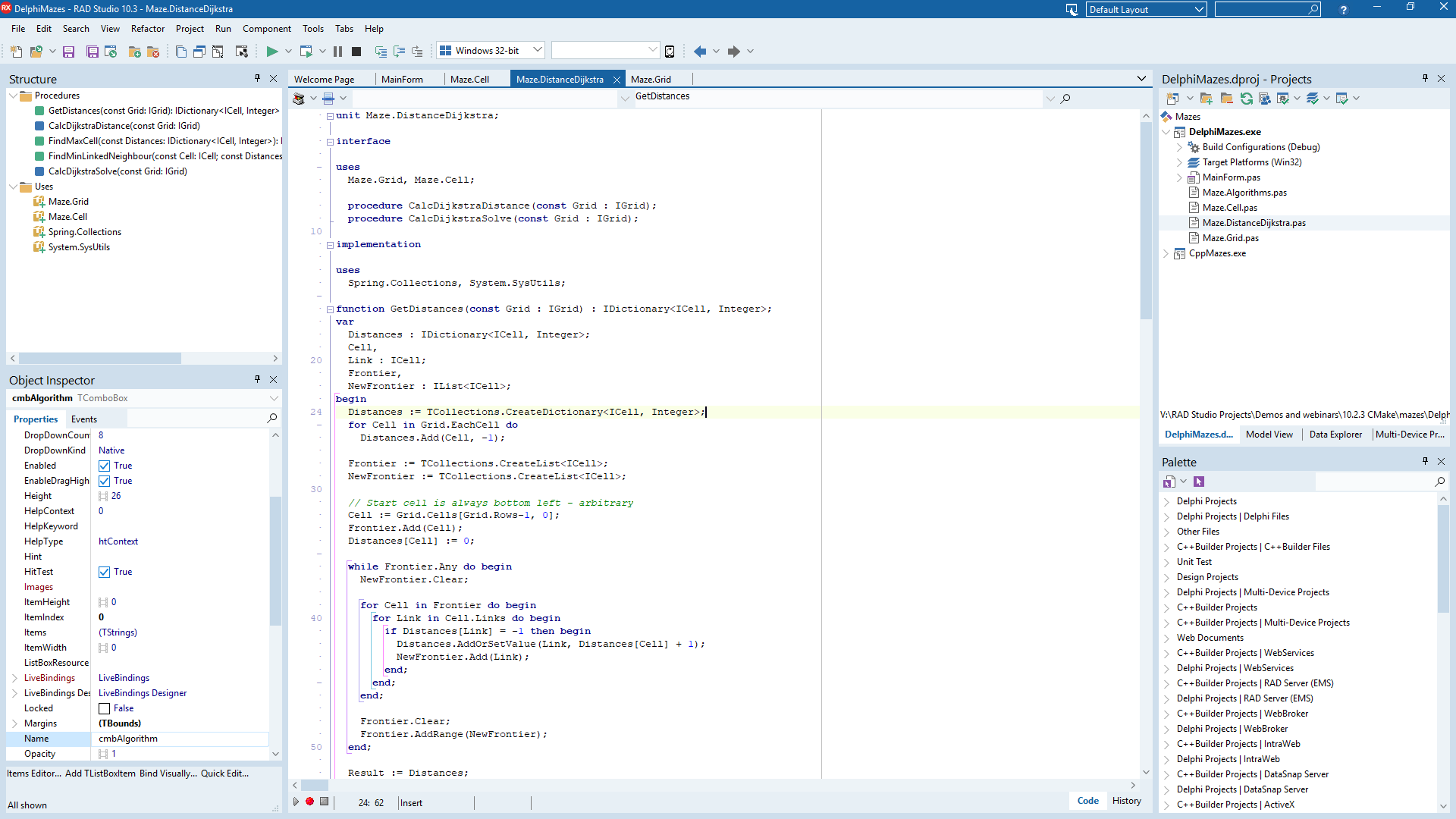
IDE UI Improvements in the Main Window is the main one to read. This looks at the overhaul and polish we added to the main window in RAD Studio 10.3, as well as a lot of the design principles and reasons behind the changes we made. It also has some nice animated GIFs comparing before and after, a great way to visually see the differences. Options Dialog Improvements looks at the IDE and Project Options, two key dialogs. These have a modernized look, but also some settings rearranged, and it examines some design principles around related settings as well. Improvements to the GetIt, New Items, and Compile dialogs examines three smaller but still important dialogs. Most changes were to usability (eg being able to scroll through all results in GetIt, vs going through pages as in prior releases), but the Compile dialog has some very nice tweaks for easy visualisation of your compile status too. |