With the RAD Studio 10 Seattle release, we introduced 5 new VCL UI controls. These controls were specifically designed for Windows 10 and address common UI paradigms on Windows 10. While they were designed for Windows 10, the new VCL controls will also work with older versions of Windows, such as Windows 7 and Windows 8.

As you can see in the screenshot above, we provide 3 new Windows 10 VCL styles in the RAD Studio 10 Seattle release: Modern Light, Modern Dark and Modern Blue. You can also create your own custom Windows 10 VCL styles using the Bitmap Style Designer.
To set a style for your VCL application, select the style in Project > Options > Application > Appearance.
TRelativePanel

TRelativePanel is a new layout panel that provides a lot of flexibility for designing your user interfaces. It lets you position and align child objects in relation to each other or the parent panel. For example, you can specify to have a text element always positioned to the left side of the panel, and a button always below the text.
Object Pascal Demo:
- C:\Users\Public\Documents\Embarcadero\Studio\17.0\Samples\Object Pascal\VCL\RelativePanel
C++ Demo:
- C:\Users\Public\Documents\Embarcadero\Studio\17.0\Samples\CPP\VCL\RelativePanel
TSplitview
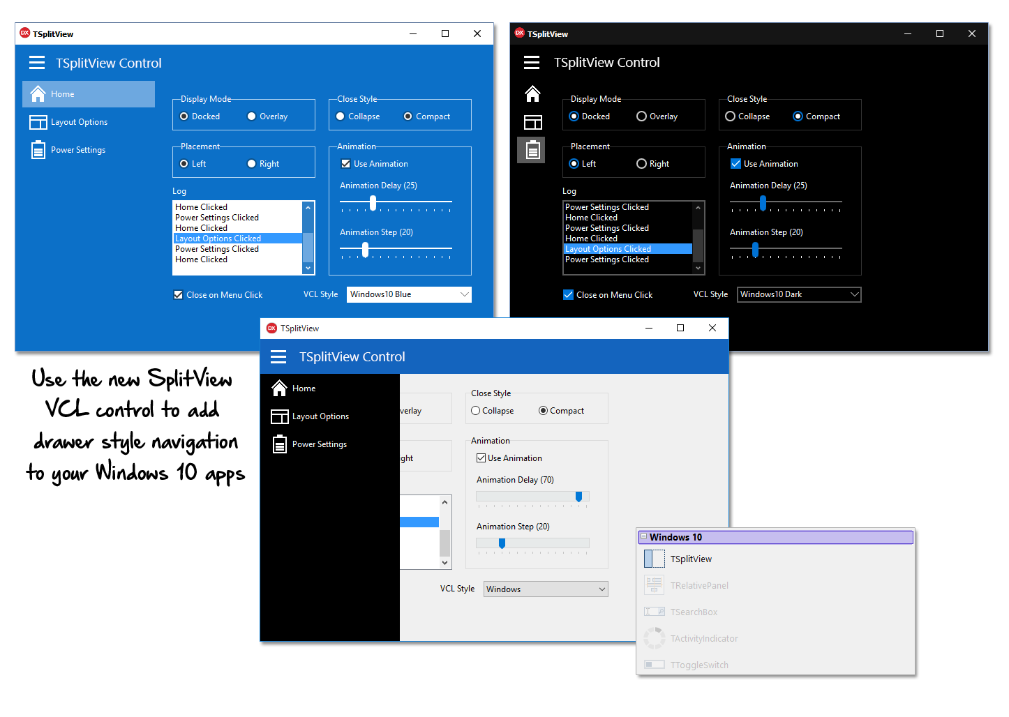
The new SplitView control allows you to easily show and hide application content and is designed to be used as a navigational menu, such as a slide in drawer menu. Choose from Docked and Overlay display modes, and Compact and collapsing menu closing styles.
Object Pascal Demo:
- C:\Users\Public\Documents\Embarcadero\Studio\17.0\Samples\Object Pascal\VCL\SplitView
C++ Demo:
- C:\Users\Public\Documents\Embarcadero\Studio\17.0\Samples\CPP\VCL\SplitView
TToggleSwitch
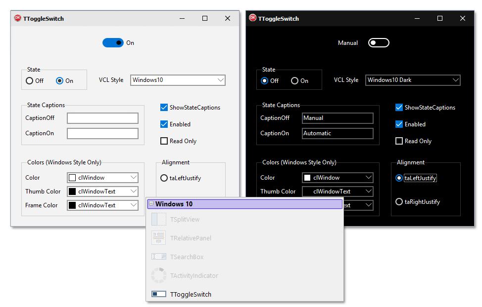
TToggleSwitch is a switch control with two states, on and off. You can easily hide the switch state captions or provide your own custom text.
Object Pascal Demo:
- C:\Users\Public\Documents\Embarcadero\Studio\17.0\Samples\Object Pascal\VCL\ToggleSwitch
C++ Demo:
- C:\Users\Public\Documents\Embarcadero\Studio\17.0\Samples\CPP\VCL\ToggleSwitch
TActivityIndicator
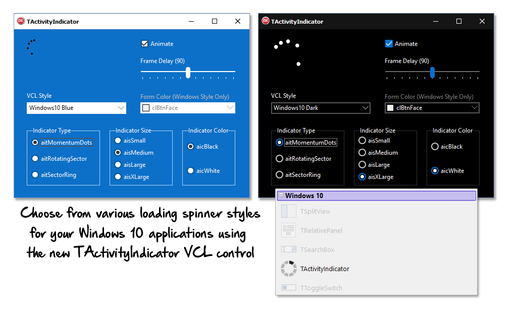
TActivityIndicator is an indeterminate progress ring indicator. This indicator lets you choose between several types and allows you to modify many visual properties, such as size, speed of animation and indicator color.
Object Pascal Demo:
- C:\Users\Public\Documents\Embarcadero\Studio\17.0\Samples\Object Pascal\VCL\ActivityIndicator
C++ Demo:
- C:\Users\Public\Documents\Embarcadero\Studio\17.0\Samples\CPP\VCL\ActivityIndicator
TSearchBox
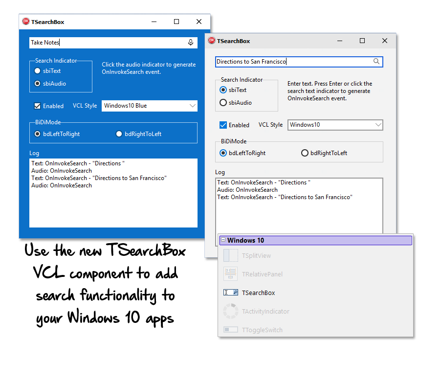
TSearchBox is an Edit control with search capabilities with many customizable properties.
Object Pascal Demo:
- C:\Users\Public\Documents\Embarcadero\Studio\17.0\Samples\Object Pascal\VCL\SearchBox
C++ Demo:
- C:\Users\Public\Documents\Embarcadero\Studio\17.0\Samples\CPP\VCL\SearchBox
Click on the video below to see the new VCL features in action: