How do you design a user interface (UI) to be understandable and easy to interact with? In this series, I’ll give some thoughts on good design, combined with examples.
This series is intended as practical UI design advice for small teams or individual developers. Many larger teams or companies have UX staff who can advise or run the process of UI design. Typically, a UI design process would be involved as part of the feature development process, something like:
- UI design requirements gathered as part of feature requirements
- UX team:
- Analysis (starting at feature analysis and how it should be conceptually presented to the user, down to smaller things like what kind of control is best for interaction or data)
- Wireframe or mockup
- Evaluate, refine
- Add final design to the feature specification
- Developer: implement design as part of feature work
But many teams don’t have access to a UX expert. The ‘UX team’ dot points above will be replaced by developers or product managers with a much wider focus. If that applies to you, then this article is practical advice to go from an initial concept (whether that’s a UI mockup, or a first-version UI created by a developer as they implement the feature) and refine it. It may not be the approach taken in a large corporation, and it won’t address graphic design or ‘good looks’ until the very final blog post, but these steps will teach you principles or give you guidelines for creating something both modern and highly usable by your users.
We’ll start with an example of a bad UI, one based on a real-world dialog I saw recently. For the sake of this article, let’s assume this UI is either a draft / first-run UI created by a developer as the feature is being developed, or is the first wireframe or mockup of a UI as you create the specification for an upcoming feature. It may also be an existing UI that you want to improve.
However the UI is arrived at, throughout this series we’ll improve it, examining useful principles you can use to either improve your own UIs or create great new ones, in practice. If it is an existing UI, this refines it; if it is a mockup, this illustrates practical approach to the review and refinement process to arrive at a final mockup and behaviour for your feature.
UI vs UX
What do we mean by UI design? And does it overlap with UX?
UI design is simply designing a user interface. UX is a term for ‘user experience’. Effectively, UX is the overall effect of using an application. Was it clear? Frustrating? Pleasant to look at? (Note those three things all speak to different aspects of the experience – clarity, intuitiveness or understandability, and graphic design.) It’s a broad term, but ultimately you want your application to have good UX in that you want your users to feel happy using it. Providing an intuitive flow to your application is key for new user adoption and retention, and well thought out UX provides that. That’s also a reason why a growing number of companies perform UX testing with focus groups during their application development cycle to ensure a good user experience.
UI design is a key part, but is not the whole, of good UX. This series focuses only on designing your user interfaces.
In addition, this series focuses on practical UI refinement, and on usability. Shiny good looks are left to the very last post.
Basic principles
Let’s begin with some basic principles that will be elaborated on through the series. We will look at specifics as we go through the series and improve the example ‘bad’ dialog in practice.
Some higher-level principles are:
- Function not looks. A well-designed UI does not mean that it is pretty. There are many nice-looking UIs which are hard to use. We will examine how to make a UI look aesthetically pleasing, but this is one of the last steps in improvement.
- It’s all about understandable data. A UI is all about data onscreen. ‘But I don’t have data’, you might say – yes, you do. Any content shown to users (items in lists, previews in ribbons, text in an editor, the caption of a checkbox or button, etc) is data. Because it is about data, UI design is about clarity. Make the data presented onscreen understandable, and a have clear effect for all possible actions
- Communicate relationships visually: a UI is not just boxes placed onscreen, but related boxes placed onscreen. Understand the relationship between data shown onscreen, and use visual layout to communicate that. Grouping into logical categories is a great way to add structure to your UI.
- Simplicity is not clarity. Simplicity, such as only a few controls, does not mean it is clear. A cluttered UI also has that effect, so striking the right balance is key. It is common, if you are used to desktop design, to use too many controls when designing your first mobile UI. Similarly, you may try to follow modern desktop design by using a sparse layout, mistaking few controls for use of whitespace. Both these can be mistakes.
- Be cautious in innovation. Try not to invent new controls or styles. They may be fun but can be confusing to the app user. Usually, your operating system or UI library will provide premade controls that users are familiar with. For example, Windows 10 provides some new controls (switches and calendars, also provided by the VCL) that while new in the OS, are not new in that users are already familiar with the concept, and by being used throughout the OS are quickly standardized. Following OS UI guidelines and using common controls ensures quick understanding of a UI, thus increased usability for your users.
And very related is: - Copy what other people do. Follow conventions; don’t surprise the user. If there’s a common pattern in other UIs, use that. Users will understand it.
What is an intuitive UI?
The last two points are related to ‘intuitive UI design’, something often mentioned, meaning a UI that users can pick up and understand without preconceptions. A large amount of what is ascribed to making a UI ‘intuitive’ is in fact not a new concept easily understood; it’s familiarity, meaning people ‘intuitively understand it’ not because of some magic design that makes it truly intuitive, but because they already know how to use it, even if they don’t realise that.
Almost no-one invents truly intuitive new paradigms; it happens maybe once or twice a decade. Many of the criticisms of current UI design trends, such as Material Design, revolve around removing cues that provide familiarity.
When the iPhone was released, Apple had in-phone training to teach users the new paradigms. Many things were intuitive: they were modeled on physical interaction (skeuomorphism), such as buttons being 3D and looking as though pressable, or lists being able to be flicked to scroll.
‘Pull to refresh’, one of the most common mobile interactions today, was invented in 2008 by Loren Brichter for Tweetie, a Twitter client. It’s a great example of a non-skeuomorphic interaction paradigm, in that in the real world lists do not have items appear at the top, but scrolling to the top of a time-sorted list is the obvious place to discover more recent items.
Intuitive UI Case 1: Mobile OS Back Buttons
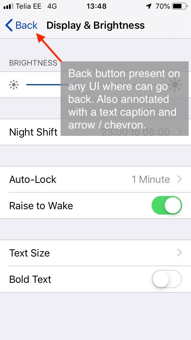
I recently saw a friend, an Android user, pick up my iPhone and try to go ‘back’. For a few seconds, their thumb hovered over the bottom left of the screen and they audibly said, ‘ah…’ in a confused tone, before hitting the Back button on the top left.
 |
 |
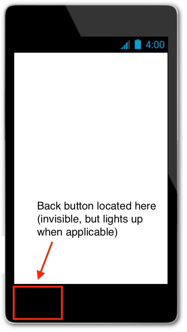
| Android: the Back button is on the lower left, and is hidden until applicable. It is a symbol only. |
iOS: the Back button is onscreen as a UI element, is always shown in any UI where you can go back, and has a text caption. |
Is this an intuitive UI? From learning, from use of Android, they expected to go back through interaction on the bottom left of the screen. There are a few interesting things to unpack here:
- Android uses an unlabeled triangular symbol to go back. It needs to be learned, but once learned, people are used to it
- iOS uses a left-facing chevron, and it is labeled Back. This makes it discoverable for people searching for the functionality: it is objectively clearer than the Android design
- Back in both OSes is on the left, and the direction indicator faces left. This mirrors Western physical textual UIs, books, where earlier content is accessed by paging left.
- Neither are implemented as a traditional button: that is, something with a UI indication that it can be tapped or pressed (a 3D look.)
The last point is one of the most significant criticisms of current UI design trends: removal of subtle indicators. This isn’t always a problem – consider toolbars in desktop apps, where in the late nineties, starting with Office 97, they were rendered without 3D borders by default. Later, even the mouseover 3D borders were removed and today it’s common for them just to highlight with a solid colour when moused over. People have learned that images in a horizontal row are usually clickable, so any toolbar today is ‘intuitive’.
Many current trends have images in many random places, some of which can be clicked and some cannot. There is no way to visually tell the difference. That is unintuitive design.
In this situation, the iOS button is both standard in all system apps, and has text. Both of these mitigate the loss of visual indication of interactivity from earlier iOS designs where interactivity was indicated by drawing it like a physically interactable item, a button. (This is called skeuomorphism: physical metaphors in digital, 2D UIs.)
Intuitive UI Case 2: Google Calendar Edit Button
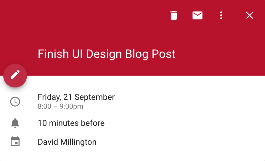
This is Google Calendar’s popup window when clicking on an event:
It has a title, and some details in smaller text.
There is also a row of buttons to interact with the event in a number of ways at the top: close, delete, email, and a hamburger item to see more: a toolbar, a familiar interaction.
How do you edit the event?
The Edit button is nowhere near any other interaction. It is halfway between the title and details, and has almost the same background colour as the title background, making it hard to visually spot – it does not stand out.
What’s wrong with this?
- It is inconsistent: editing, an interaction, is in a different location to all other interaction
- It is visually difficult to see, it is camouflaged
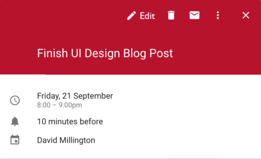
A better design would place the edit button near other interaction but, recognising it is the most important and likely to be clicked of all interactions, make it more prominent:
Here, Edit is an action on the toolbar like all other actions. It is found when looking at the list of interactions: it is no longer standalone and needing to be discovered separately. Because it is the most important, it is placed first, and it is annotated with a text label so it is clear – you do not need to interpret the pencil icon to know what it does.
The original is a great example of an unintuitive UI: a specific interaction needs to be learned, and you cannot apply rules you already know (toolbar buttons in a row, look for interaction with other interactions) to this case, nor is it visually distinct or called out. It is a once-off, unique action, camouflaged.
Principles In Action
Those principles may sound good, but describing visual design in words is not as useful as showing it implemented in practice to turn a badly designed UI into a clean, modern, understandable and intuitive UI. Over the next couple of posts, we’ll look at an example badly designed UI and improve it, following the principles above.
Starting point: A ‘bad’ UI
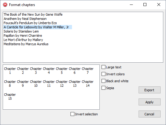
The following image is inspired by a real-world dialog I saw recently. This screen, as shown below, has been anonymised and has an entirely made-up purpose: it is a dialog to export books to file, with various formatting options. Have a look:
This UI presents a list of books. For the selected one, a list of chapters; then some formatting options, and some fairly standard dialog buttons. It is not complex. Yet, looking at it, a user might have a number of questions:
- Why am I selecting chapters? Am I, or are they just being displayed?
- How do the formatting options interact? What if I check both Black and White and Sepia? Or Sepia and Invert Colors – will I get something mostly blue?
- Can I select multiple books?
- What selection does ‘Invert selection’ invert?
- How does that work, anyway? If I uncheck it, will it change? What if I change my selection in the meantime?
- What does Apply do?
Questions like these indicate confusion. This is a simple UI, with only a few controls, yet it creates uncertainty. You want to empower your users, and make them feel they understand what they’re interacting with and what they’re doing. A dialog that causes questions is a good indication that the UI is suffering from some design problems.
We will use this dialog as our starting point, and improve it throughout the series.
Next steps
Next post, we’ll see some guidelines on how to analyse a UI and discover an underlying structure that can be clearly presented. That structure can then be reflected in the UI design. The ‘bad’ UI mockup we have will be refined.
Until then, the exercise of asking questions about a UI is a good one. Try picking one of the dialogs in an app of yours, and approach it trying to know nothing about it. What questions, like the above list, can you come up with? Pretend you’re tired, have not yet had a coffee, and are unfamiliar with the app — and see what questions you might ask.
Update Oct 3: Part 2 of this Great UX Design series is published. Read it here!
