Welcome back! Last time, we discussed a typical UX design flow, and how to tackle this if you do not have access to a UX designer. We also looked at some key usability principles, and saw an example ‘bad’ user interface that we will improve step by step through this series. Finally, we examined that bad UI and some of the questions and confusion a user might have when interacting with it. If you haven’t read the first post, please do – it covers some essential topics before what’s covered this time.
This post, we’re going to examine the ‘bad’ UI critically in order to understand its purpose, and then how to structure the UI to better implement that purpose. At the end of it, you should have seen a good example of ‘getting into the user’s head’, or examining something from your users’ point of view in order to understand it how they understand it.
The UI we end up with will still look very ugly, and not be finished, and still have problems! But the core redesign to improve its function – focusing on understandability and usability, not looks – will be complete.
There will be more posts in the series to improve the dialog further, such as layout and following platform conventions, as well as making it look nice. It’s important to note that the series improves the dialog step by step, incrementally in each post, and we’re not yet finished.
Answering Questions and Solving Confusion
To solve your confusion, you must first be confused.
Sound like an inscrutable piece of pseudo-philosophical advice? Here, it means that we need to understand why our users may be confused, or understand how our users perceive a UI. From that, we can make it clearer. It is very hard to make it clearer without first understanding what makes it unclear.
As a developer, or anyone closely tied to development like a designer or product manager, it can be hard to put yourself in your user’s shoes. You’re very familiar with the software, and likely understand it inside and out.
How do you view your software with user’s eyes? It’s difficult, but I’ll share my own approach here.
It’s important to remember that your users almost always won’t know the software as well as you do, and won’t understand why something works the way it does. What they will see is what is presented – which is the UI. There won’t be knowledge about why things are presented a certain way (reflecting the underlying data, for example). All users will see is what’s on screen.
Second, the underlying data structure or the way your program is architected has nothing whatsoever to do with how the user expects it to work. Someone approaching software will not be aware of its internals.
When viewing a UI, this means you need to drop everything you naturally already know about the software. Forget how it works. Forget even what it does because that too may not be known to a new user. Instead, approach it with an aim: “I want to use the software to do X.” This is a use case, and your features will have been built to allow specific use cases, but try to come up with one that isn’t a design case rephrased.
Thus, the best way to enter a user’s head, and see confusion that they may see, is:
Approach it with an aim. You are a user trying to use the software to achieve something. Your task is to figure out how to use it.
Questions about the example ‘bad’ UI
Let’s revisit our sample bad UI:
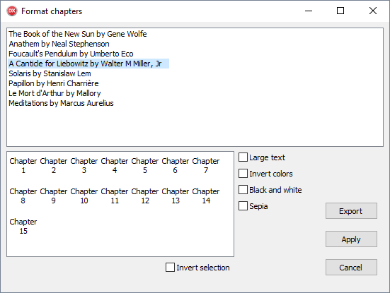
This is a mockup, or an initial draft created by a developer when implementing the feature.
We know this is software to export a book. One can infer there were a number of use cases for the functionality this dialog exposes, probably along the lines of:
- User wants to export one or more chapters to their Kindle
- User wants to read in white on black text, for easier reading at night
But we should forget those. For our own UI design, what is our aim? Be specific: you are using it for a purpose. “I want to save my copy of Solaris to PDF.”
A user with this aim can now begin to ask questions about the dialog. Some of these questions will prompt changes to reduce confusion.
Questions
1. What is the purpose of the dialog?
To export books.
2. Ok, then why is it called Format Chapters?
I don’t know.
3. Why does it list the books?
In this app, there is probably a book list elsewhere – not shown here, but likely a list of books in a book collection application. Most likely, you would select or multiselect, and click an Export button or menu item to show this dialog. This dialog is not the main app. So why are the books listed here?
The answer to the question is: I don’t know. Nor does it make sense.
This gives us an action item: Remove the book list from the UI.
Now we’re getting somewhere. Working assuming that the app lists books elsewhere, we found a point of confusion we can answer. Here, we can remove the list of books from this dialog, because it exists at a previous level in the app. This simplifies the UI, yes, but more importantly it simplifies the function of the dialog. The dialog is no longer also a book selection dialog: it is now only a book export dialog.
4. Why does it list chapters?
Listing chapters implies a use case of only exporting some chapters. Is this valid? How often do you want to export only chapter 5 of your book to your Kindle? Not often, but it may be valid for textbooks, for example. If this is a valid use case, the functionality is valid and we need to consider how to reduce confusion without removing the function.
5. Ok, but how is exporting specific chapters handled when exporting multiple books?
Again a good question. One possible solution is to allow choosing chapters only when exporting a single book.
6. How do I know which chapters I’ve exporting?
It’s hard to say. Ok, let’s make it clearer: say, checkboxes next to the ones to export, and add buttons to check/uncheck all chapters.
This is an example of making the UI familiar. Currently, you have to highlight or select chapters – and noone would guess that. You rarely select items as squares in a grid (this does happen in some Explorer views.) More often and so more familiarly, you select items in a list, or you check or uncheck items in a list. We’ll go with the second, since a selection is fragile (click the wrong place, you destroy it) and we are choosing items, not selecting and interacting.
Another action item: replace the chapter list with a check list box.
All chapters should be checked by default, making the default to export all. The reason is that usually you’d want to export an entire book.
7. There’s a lot of questions here about exporting just some chapters
Yes! So this feature itself is really confusing. This is a good insight and might lead us to redesign the app’s flow entirely. However, in this case, since we’re only examining one dialog, we won’t. We know the feature is important, but it’s a less common use case than exporting an entire book. Yet it appears that we need to check all chapters (or verify they are all checked by default) just when wanting to export a whole book.
This is an example of unnecessary choice. If someone wants to export an entire book, they have no need to select chapters. They also don’t want to be asked what chapters, because that will be an area of concern – ‘Am I exporting the whole book?’ is a type of ‘Am I achieving what I want to achieve?’ and that’s a bad question to prompt.
Let’s make this clearer. We have another action item. Use two radio buttons, one to export the entire book, and one to export parts of it. This makes the choice clear. The chapter selection is only entered into if actually desired.
The use of specific controls, such as why a radio button not a combo box or some other control, will be discussed in the third post.
8. That formatting is confusing: invert colors, black and white, sepia? What if I choose sepia and invert, is it blue?
Blue is perhaps the best result of inverting sepia, because another and more likely alternative is that there’s an error message when clicking Export. The user did something completely logical and following the rules – checking two checkboxes, which are not presented as contradictory but are next to each other. Yet clicking the action button on the dialog will likely give an error – indicating that the user did something wrong. This is not the case. The user did not. Giving an error for behaviour your UI presents as valid is user-hostile.
We can simplify this by making the color options a list:
- Black Text, White Page
- White Text, Black Page
- Dark text, Sepia Page
This is much simpler to choose from. This would likely be presented as a combo box, though we’ll examine how to match specific controls to choices in the next post. This combo will have a label indicating what the combo contains, that it controls formatting. This can be implied from the combo contents (especially since we’ve labeled them so well, ‘Black Text, White Background’ rather than ‘Black and White’), but it adds clarity.
9. What does Apply do?
That’s a very good question. The purpose of this dialog is to export, and it has an Export button. Apply just doesn’t make sense. Saves the settings, perhaps?
Another action item: Get rid of the button. The last exported settings will be saved.
The Export button is already clear. It’s good to label by function. ‘Ok’ or ‘Cancel’ are common pairs, but there’s no need to stick with them, especially Ok. Use single-word actions: Export, Save, Delete.
Changes based on questions
Based on approaching the dialog with our aim in mind, and asking questions, we came up with the following changes:
- Remove the book list from the UI. The book or books are chosen in the previous part of the app (perhaps where it lists all books in your library). The dialog is now not a book selection dialog; it is a book export dialog — only. Single purpose.
- Allow selecting which chapters to export only when exporting a single book. If the dialog is opened from multi-selecting books, you can only export them whole.
- The chapter list should make selection to export clear: change to have checkboxes next to each chapter.
- Clarify if the user wants to export chapters at all. Mostly, they probably want to export the entire book. Give them that choice as a higher-level option than the chapter selection, and make exporting the whole book the default. We chose two radio buttons.
- Change the color options to a list, of which only one can and must be chosen. This combo box has a caption, because it is important to indicate, in a list, what you are choosing.
- The Apply button is purposeless; remove it.
Applying these changes, we now have a dialog that is more functional and easy to understand. Looking at it prompts fewer questions. Behaviour is clear.
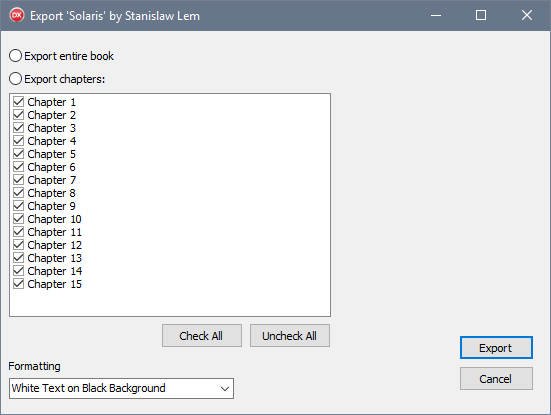
If you examine that UI, you have fewer questions about how it works, or how to achieve the goal of exporting your book. It is, objectively, a clearer and more usable user interface.
It still does not look nice. It is not pretty. It is badly laid out. It does not look modern. Looks are the very last part of UI design: achieving the user’s aim, their use cases, is first.
Please note this is not finished and is not a “recommended” layout. It’s a incrementally improved, in steps – and we have more steps to go. More on that in the next post!
Summary
In this post, part 2 of the series, we looked at an approach to see your application with fresh eyes: to forget your knowledge about the internals and approach using it with an aim. Then, we applied this to the example ‘bad’ UI and made it significantly easier to understand. It is still ugly and not pleasant to look at. That, and other refinements, we’ll look at in the third post.
Update: Part 3 of the Great UX series is now published. Read it here!