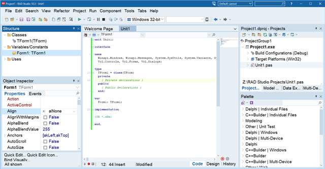
RAD Studio, Delphi and C++Builder 10.3.3 were released last Thursday, Nov 21 2019. There are a number of great improvements this release, and in this post we'll look at some of the tweaks and changes to the IDE itself.
Features
Editor tabs show modified status
In 10.3, we improved the IDE's look and feel, a careful improvement to the look and feel, following a number of UI conventions we either directly followed, or designed based on the IDE itself, to resolve a large number of UI issues that had accumulated over time, and ensure the IDE was clean, modern, and easy to look at and use in both Light and Dark views. (A comparison between 10.2.x or earlier and 10.3.x is illuminating!) We were careful to retain the same UI elements, same toolbars, etc; it was polishing and cleaning the IDE. We retained almost all UI features, but a couple of smaller items were not included when we released 10.3, and we've reintroduced them now in 10.3.3.
One of these features, and which many customers have asked to bring back, was an easy way to tell when a file was modified in the editor. In the past, editor tabs had a very small red pencil overlay on the tab icon, and that was no longer shown. In RAD Studio 10.3, the editor tabs once again show when a file has been modified and not yet saved.

RAD Studio showing a dot on an editor tab when the file is modified.
In keeping with the new look and feel, rather than a tiny (circa 6-8 pixel high) overlay, we have a more modern and clean indication, a large dot on the editor tab. This is larger and easier to see, and you'll see similar indicators in other editors. Here, both the Maze.Cell unit and MainForm have been modified and not saved. When you mouse over where the dot is, the normal X button to close a tab appears.
Changing IDE Font and Font Size
Another feature re-introduced from before the 10.3 IDE makeover is the ability to change the IDE's font and font size. This is useful for making the IDE draw its UI larger, especially since we don't yet support high DPI scaling (it's on the roadmap soon!), as well as for those with difficulties with vision which larger text can help. We've brought this back in 10.3.3 in a new and improved form.
RAD Studio using Arial 14pt as the main IDE font
You can see all items on the main window respect the font change: the menu bar (and menu items if you open a menu), the docked windows like the Projects, Structure or Object Inspector, the editor tabs, and more. The IDE follows some UI design rules, such as all elements aligning on a grid of 4 pixels, and all elements retain this behaviour even with a custom font.
Dialogs like the Options dialog do not use this setting – the reason is that the dialogs are already as large as they can get for the minimum screen size in the system requirements; also that we want to focus on true high DPI support, so have limited this work to the main window. We did, however, want to reintroduce this, especially to assist those who needed it for eyesight reasons.
This is a much cleaner version of the feature than we had in the past. It is applied thoroughly to the main window, and elements resize appropriately based on the font size.
This setting requires the IDE be closed before changing, so is not yet on the Options dialog. Instead, you need to edit the registry. Only do this if you're confident editing the registry. Close the IDE, and open the Registry Editor (regedit).
- Navigate to HKCU\Software\Embarcadero\BDS\20.0\Theme
- To change the font name, add or edit a string value with the font name, such as 'Arial', without quotes. If you enter an invalid font, the default system font will be used.
- To change the font size, add or edit a DWORD value with the font size in points. (Note that the registry editor uses hexadecimal by default; you may want to toggle to decimal in the value editor.) There are no constraints on the font size value, so it is possible to enter one that will make the IDE look very odd. We recommend between 8 and 20 points.
- We also recommend you delete the Toolbars key, so that the toolbar positions will be recalculated instead of the IDE attempting to position them at the right position for the previous font setting before you changed it. (Toolbars and menus are affected by the scale.)
Welcome Page Tweaks
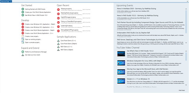
The Welcome Page is a useful page that shows your recent or favorite projects, events you might want to register for, and some of our recent Youtube uploads. We plan to rework the Welcome Page in a release soon (and are interested in your feedback!), but in 10.3.3 we made a few small tweaks, including:
- Shortcuts to create new VCL applications, not just FMX
- Cleaner and more readable spacing for the Events and Youtube feeds
- Some new icons
- Hiding the Events and Youtube feed is now a small link in the bottom right
The Welcome page in RAD Studio 10.3.3
Theming Improvements
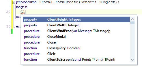
The code completion dropdown is now themed:
The code completion window in 10.3.3.
Items are also now drawn very slightly higher (only a few pixels each), to be better spaced and align size with the list item height used elsewhere in the IDE. A code completion window that used to display twelve items will now show ten, which is still reasonably high. You can always resize the window to fit as many items as you wish by clicking and dragging its edges or corner.
This also fixes a long-standing bug that's been present since Windows 7, where the code completion window shadow was sometimes offset, ie not in the right position, and the completion window had a thick bar at the top. We think this was actually a WinAPI bug introduced in that version of Windows that affected the combination of styles the completion listbox used – it was not a common set of window style bits especially for that control. In 10.3.3, you can see now that not only does the shadow render correctly but the completion window itself looks much cleaner.
At the same time, we fixed a bug introduced in 10.3.2 where the highlighted item in the completion window used the IDE theme highlight colour, not the editor colour scheme highlight colour, which sometimes made the selected item hard to read, especially with the Classic theme. This now draws using the editor colours, always.
The code completion window in 10.3.3 using the Classic editor colour scheme.
Quality
The above mentions a few quality fixes as well as features, but in 10.3.3 we also addressed IDE issues in a number of other areas:
- A series of issues to do with the IDE window resizing when switching between debug mode or editing, when you restored/maximised, or when you moved it between monitors
- Small UI fixes in many windows, including window borders
- Miscellaneous theming fixes, especially to do with the controls in the IDE title bars
- Miscellaneous glitches in the editor tabs, menus in the IDE (especially popup menus), and editor tab menus
- And more.
Overall
Delphi and C++Builder 10.3.3's IDE is faster, more pleasant to use, and restores some features you may have been looking for. If you have Update Subscription, you can install 10.3.3 today!


