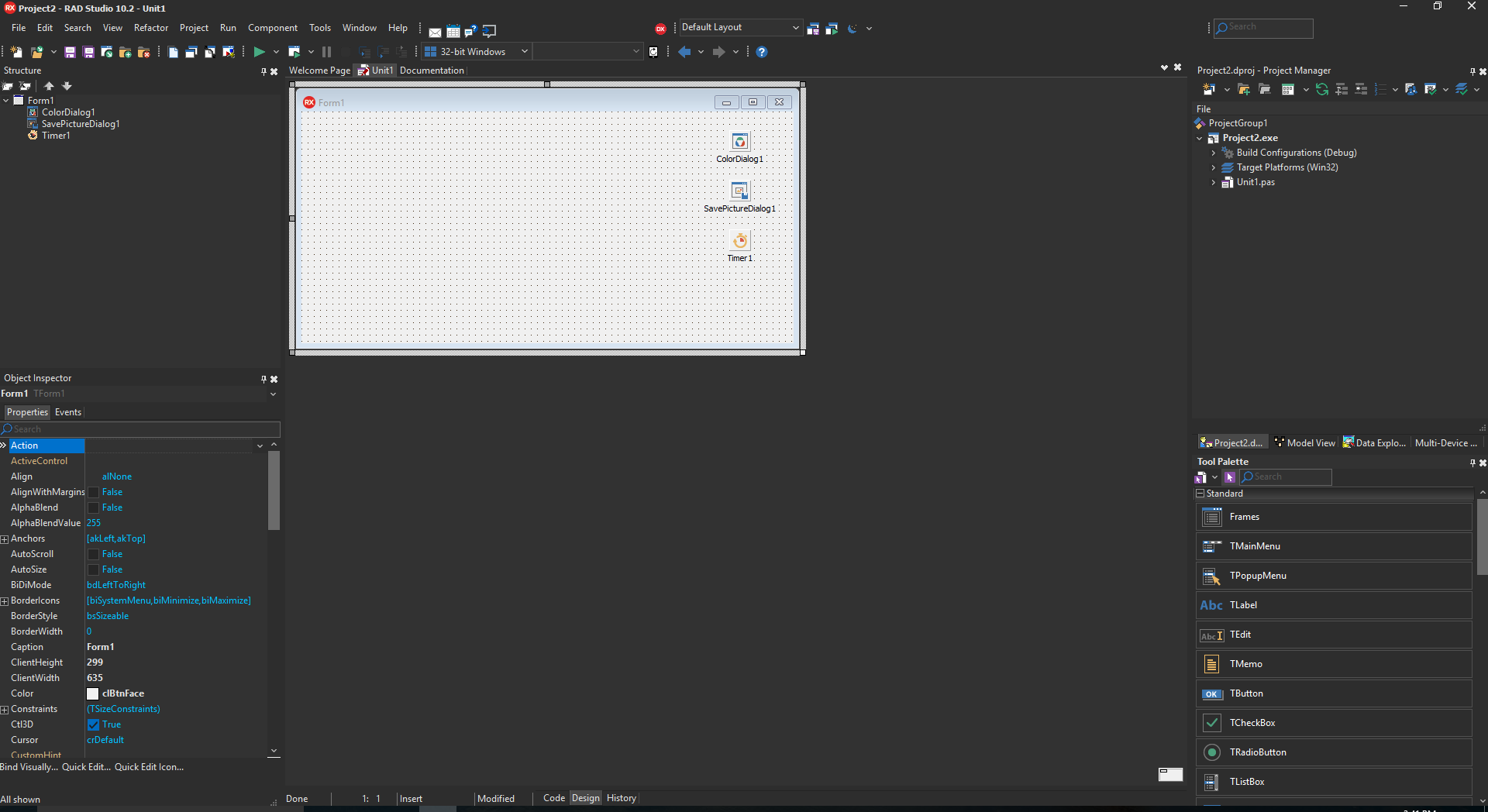
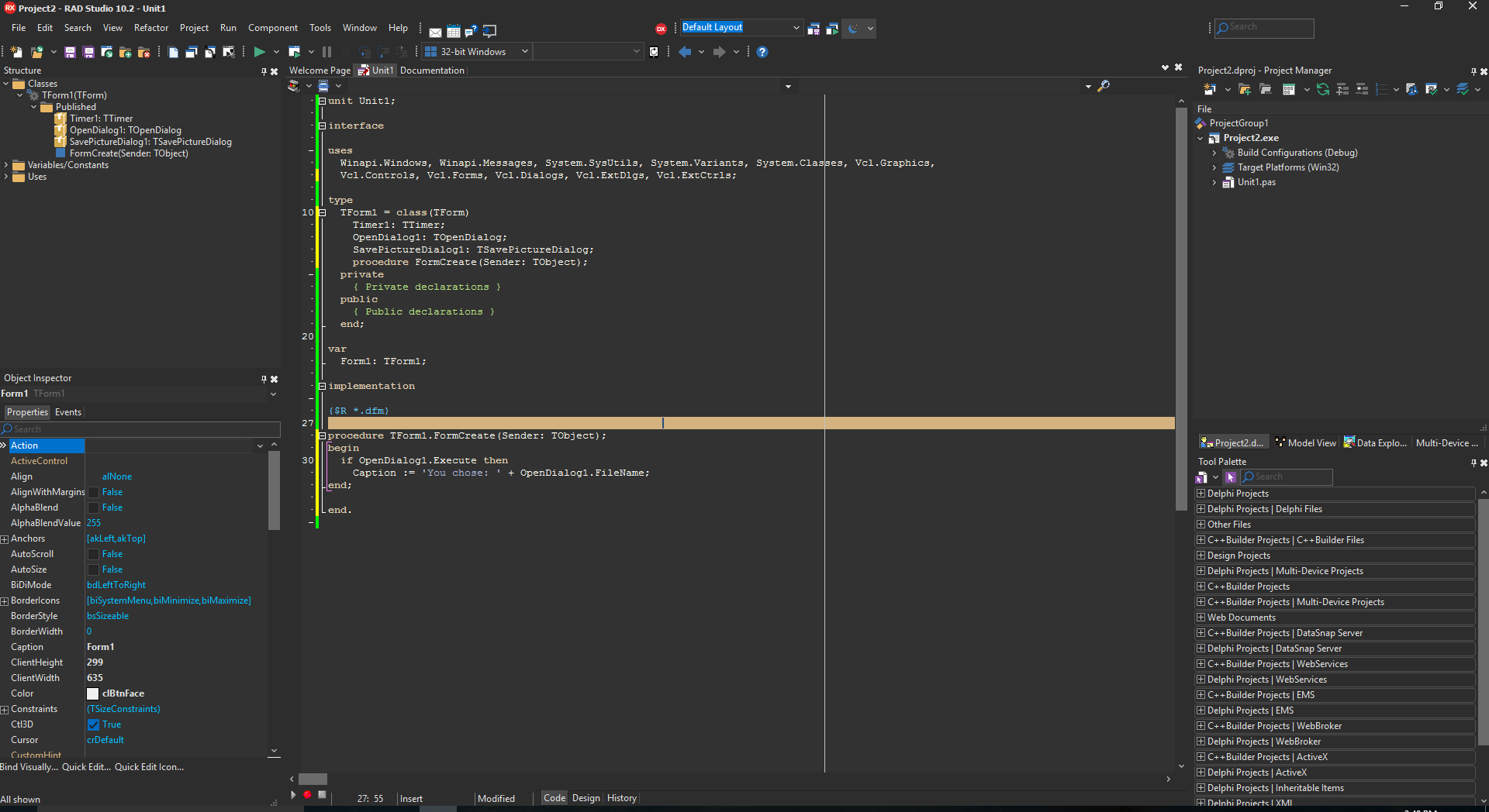
In Delphi and C++Builder 10.2.2, we've added a commonly requested and exciting new feature: a dark IDE theme.
Many productivity tools, or tools that are used for many hours in a row – and RAD Studio certainly falls into that category – offer a dark theme. Why?
- Many people find it reduces eye strain, and so a dark theme is easy on the eyes and great when using an IDE for hours on end
- If you work in the evening, a dark theme reduces the amount of light, useful for health
- It looks cool.
We're very excited to have this feature in 10.2.2. Let's have a look!
Welcome to 10.2.2!
When you start the IDE the very first time after installing, you'll be greeted with this new Welcome dialog. We want to let you personalize the IDE a little right from the beginning, and so this dialog says hello and invites you to make some common tweaks. The very first one is to choose your theme:
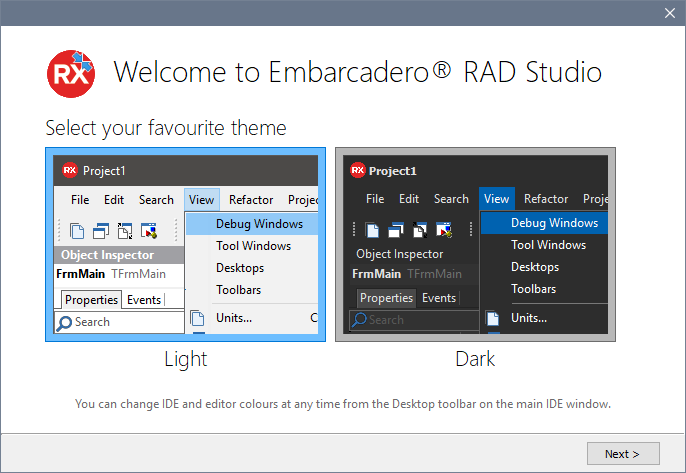
Of course, you can change the theme at any time (more on this below).
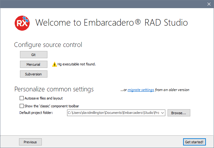
The second page gives you a few common settings:
One of the results from this year's developer survey is that 30% of our users don't use source control at all. While we're very glad that 70% of you do, we do want to promote good coding practices and also assist you in using our IDE integration for source control. So this dialog allows you to set up source control right here from the very start of using 10.2.2.
There are also a number of common settings users often configure: to autosave files and layout, to show the classic component toolbar, and to choose the default project location. This is where projects are saved to by default (create a new project, save – the folder that dialog opens to) and is also used when clicking the Open button. It's very common for people to have their own favourite location – the root folder for their source control checkout, for example. I personally have all my projects on a shared drive, shared between all my VMs.
You can also open the settings migration tool to move settings from an older version of the IDE, say if you have 10.1, XE8, or some other older installation. This can bring across all of your IDE settings.
This dialog opens the very first time you run the IDE after installing, but you can re-display this dialog at any time via Help > Welcome Configuration.
Turning the dark theme on and off
There are two ways to toggle the dark theme: a fast way, and through the Options dialog.
Quick changes
The Desktop Layout toolbar has a new toolbar button to quickly toggle the dark theme on or off. Click it to show a dropdown menu:
This also lets you change the editor colour scheme quickly as well, meaning you can change the IDE theme and editor scheme separately if you with.
You might notice that intriguing "Custom" option. Let's look at that in the full Options, which you can access through the Tools > Options > Theme Manager, or clicking Options on the dropdown menu.
If you don't see this toolbar button, there's a small bug when you installed as an upgrade from 10.2.0 or 10.2.1. Read this for how to make it visible.
Options > Theme Manager
Let's look at the options in detail. In the Tools > Options dialog, there is a new Theme Manager section:
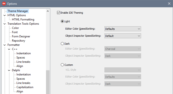
The items in the Desktop Layout toolbar's dropdown menu correspond to the Light, Dark and Custom radiobuttons here. As well as also changing the theme, this dialog lets you customise what those mean.
In the past, before the IDE was themeable, several parts of the IDE could have their colours specified and customized in different ways. The code editor is the obvious one, since it is common to change the editor syntax highlighting colour scheme. You can also change the Object Inspector's colours.
These settings allow you to define what light and dark mean: that is, define a pair of IDE theme and other colour schemes. This means that when changing to the dark theme, it will also change the editor colour scheme – you don't want to change the IDE and still have an editor with a bright white background!
The light theme is the default on you're already used to from previous versions of the IDE. The dark setting uses a new VCL theme (designed for us by DelphiStyles – they've done a great job.) You can turn theming off entirely via the checkbox at the top: we don't recommend this, but if you want to, this is the Right Way to do it. This makes the IDE look very old. Don't 😉
Finally, that interesting-looking Custom setting. We knew that once we supported theming the IDE, the very first question people would ask is, "Can I use a custom theme?" This setting allows you to do that. Choose an installed VCL style in the combo box, and you can use that scheme. It is important to note that this is not supported. We only support the Light and Dark themes. We have no control over what the IDE looks like or how it behaves when using a custom style; the setting is there because we know that many people will want to try it.
Code editing and form designing
When form designing, both the VCL and FMX form designers are unstyled. They remain looking exactly as they did. This is important because when designing, you want to design and see your form as it will look when running.
We also have a new dark / charcoal editor colour scheme, and this is the new default editor colour scheme associated with the Dark IDE theme. This is designed to work well with the editor colours, as well as in low light.
Other items
A few elements of the IDE are not themed, even with the setting turned on. These are areas implemented in .Net, or native Windows dialogs. For example, the Open dialog is not themed because it belongs to Windows; it is not a VCL dialog. However, the vast majority of the IDE, including all areas you will use most such as the form designer and majority of dockable panes, are themed.
Overview
Summary? In 10.2.2, there's a new Dark IDE theme. It also comes with a new editor colour scheme. It has a charcoal look, easy on the eyes, great for multi-hour use. It's a common customer request, and we think it looks fantastic.
We hope you find this addition as exciting and useful as we do!
