There are some nice new features in RAD Studio 10.2.2 for IDE startup and first use.
Startup
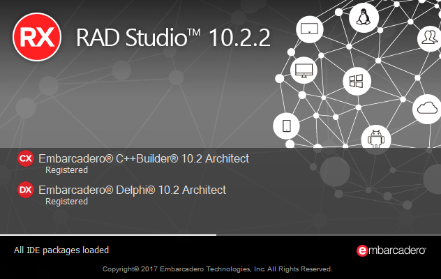
When Delphi and C++Builder start, you see a splash screen – a loading screen – as the IDE starts. This lists all the packages, plugins, and component libraries it has installed.
One common request has been to add a progress bar here, and in 10.2.2 we’ve done so.


In this screenshot, you can see the progress bar: the small white line close to the bottom of the splash screen.
Performance
If you are used to an older version of RAD Studio, that above animated GIF may seem to load very fast, to you. It is an accurate recording, however – from splash screen appearing to IDE opening is 9 seconds on my VM. 10.1 Berlin, on the same VM and as a “warm” start, takes 16 seconds. This is means 10.2.2 starts up in 56% of the time – twice as fast.
Welcome Page and Startup Layout
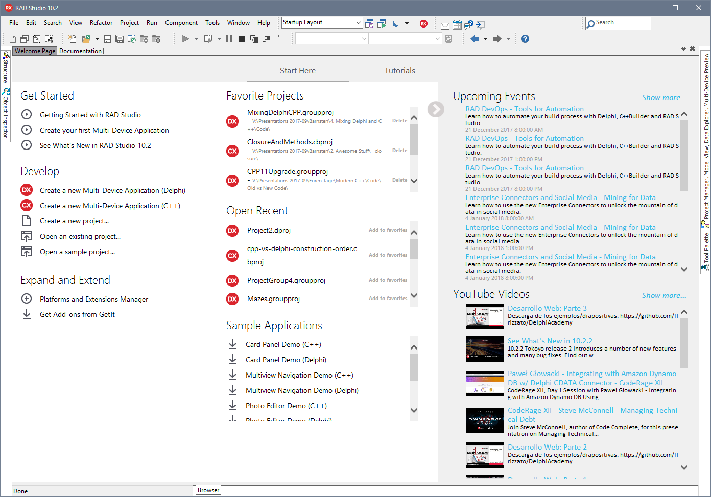
When you start the IDE, you initially see the Welcome Page – a window displaying links to create or open projects, as well as recent and favorite projects.
In 10.2.2 this is expanded. We’ve added a section displaying key samples – these are populated from GetIt, and so clicking one will download and open it automatically. These, favorites and recent projects are all listed in one column: when you have a clean install, since there are no recent or favorite projects they are at the top. As you open projects and use the IDE more, seeing samples is less important and so they move down the screen. Favorites are also now at the top; in previous versions, they were away on the bottom left corner.
We’ve also added two new feeds: upcoming events, such as webinars. These are often in multiple timezones and so you will see an entry per timezone, so you can join the one that’s most convenient for you. We also list the recent uploads to our Youtube channel. We upload a lot of content to Youtube and we hope it’s all interesting to you! Showing it here is meant to make it more visible, the aim being that you might open the IDE and see something interesting we’ve posted, or an interesting technical session, webinar, or other event coming up that is valuable for you to join.
Startup Layout
The IDE has the concept of layouts. These are predefined sets of which windows are visible and open, and you can edit them yourself – there is a toolbar to the right of the menu bar listing all layouts. For example, when debugging, the IDE uses the Debug Layout (unless you’ve specified it to use a different one) which opens the debug windows.
We have a new layout, the Startup Layout. This minimizes all tool windows and just shows the Welcome screen, since with the possible exception of the File Manager or the Palette, which shows projects but we find is rarely used to create a new project, no tool windows are useful until you actually have something open. The moment you do open something – a project, or even a file – the IDE will switch to the Default layout.
This can be thought of as a state machine, applying layout based on a transition between no files/projects open, files or projects open, and debugging. The first element is what’s new in 10.2.2.
You’ll also notice that documentation now has its own tab, making it easier to browse docs right from inside the IDE on par with code editing.
We hope you find this useful, especially the increased communication and visibility of events and Youtube content!

