In recent RAD Studio releases, we’ve paid a lot of attention to the IDE’s user interface. In 10.2.2, we added a dark theme (one of the most popular changes we’ve made!) and updated the component icons.
In RAD Studio 10.3, we have a number of further UI upgrades we’re very pleased to show you. This is the first post in a series about the IDE’s UI and user experience. Without further ado…
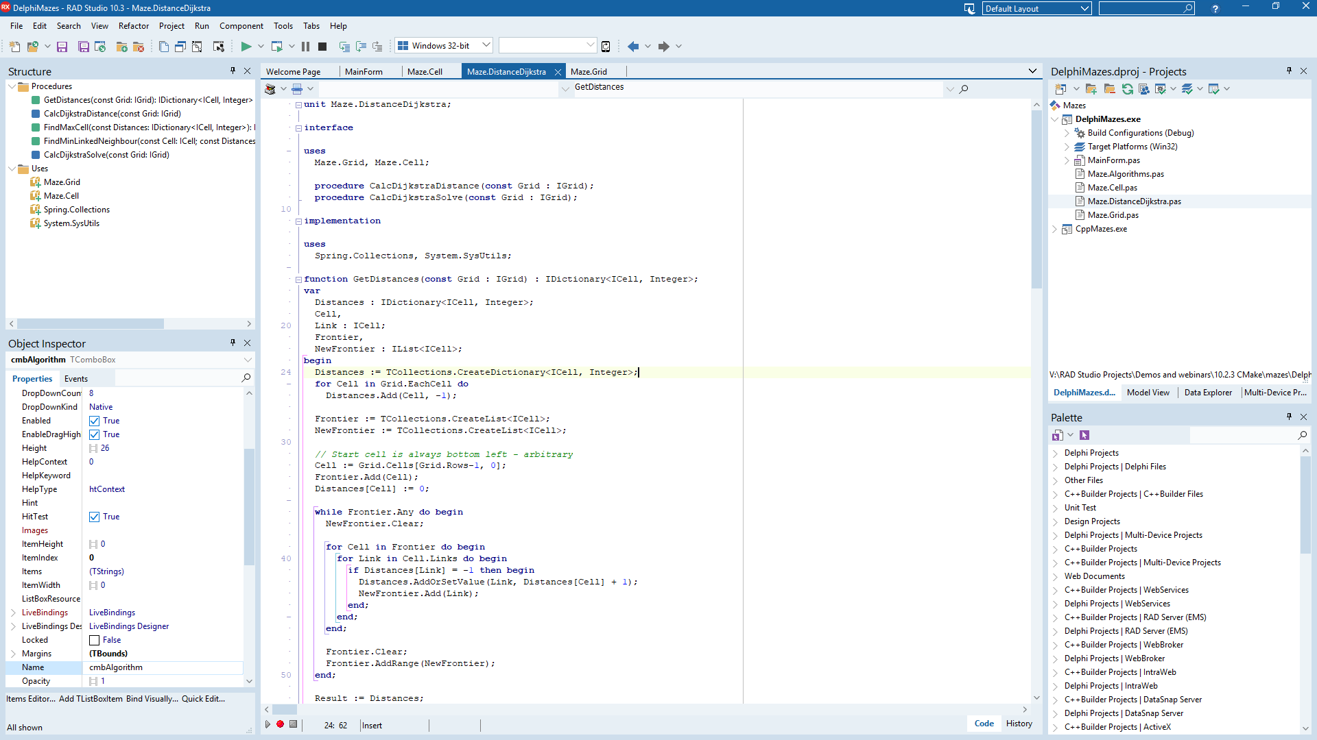
RAD Studio 10.3! (View full size.)
History
Delphi and C++Builder’s user interface has grown over the years. There was a significant revision in 2003, where the previous Delphi 1-to-7-style IDE of floating windows replaced with a newer style of docked windows in Delphi 8. Since then, there have been minor UI tweaks such as different styles for the code editor tabs or gradients on the toolbars, but largely, the visual presentation of the main window has remained unchanged.
The IDE’s main window grew as functionality was added or improved, and sometimes some elements looked unpolished. For example, in older versions of the IDE like 10.2.3 and below, there are four different ways tabs are drawn in the main window alone (code editor tabs, tabs for multiple docked windows docked together, tabs for the Object Inspector, and tabs for toggling between code and design.) It’s inconsistent. Another example is that some windows have borders, and some do not; some have multiple borders and lines for adjacent controls giving a heavier look. Or, code editor tabs draw the caption in black on a dark gray background, which is hard to read; the tabs were also quite small, so hard to click. These issues are important not just for consistency, but for usability.
The IDE is used by you, our users, for eight hours a day. Issues like the above can be fatiguing: over time, items that are difficult read, interact with, or not laid out or consistent to look at take a bit more mental effort than ones that are polished. We want to make the IDE something pleasant to use for you, since you use it eight hours a day, and also something that provides a good first impression to our new users.
This leads to a number of concrete improvements we could make.
Our Approach
Before going further, one very important thing to note is that this is considered and careful improvement, not a ‘redesign’. We’ve taken a lot of care. UI redesigns sometimes remove or hide features, such as removing toolbar buttons. (In fact, this has a name used to justify it: ‘progressive reduction’.)
We have taken the opposite approach. The IDE UI that you are already familiar with remains as it was, with all the toolbar buttons or other widgets where you expect. The updated IDE UI renders much more pleasantly, consistently, cleaner, and in a more modern style; and is better to use long-term. Here at Embarcadero, we’re big believers in practical UI design. Practical UI design can certainly look very good, and we like great-looking interfaces, but the ultimate focus must be on how you use and expect the IDE to behave, and to provide something useful and pleasant for you to use, in practical use, long-term over an entire day. The updated 10.3 is aimed squarely at those goals.
Improvements
In this work, we had two goals:
- To reduce clutter or inconsistent design, that makes the UI visually distracting; conversely, to provide a clear and elegant UI that is pleasant to look at and to use long-term
- To provide a good first impression for our new users, or people returning to Delphi and C++Builder after some time away
This leads to several concrete changes: to improve layout; and to provide a new cleaner and more modern light and dark theme.
Improved Layout
Working with a UX designer, we came up with a number of guidelines:
- Consistency in control rendering: for example, all tabs should look the same or render differently for a reason
- Excess lines and borders are removed, replaced with clear differentiation through spacing or colors
- Keyboard focus is clear: the titles for the code editor tab or docked window that contains the focus are drawn in a visibly different color, making it immediately visible where your keys and typing will go
- Spacing and alignment are adjusted:
- All elements in the IDE now align to a four-pixel grid, and all elements are lined up with each other. This single change alone made the IDE’s UI look much cleaner
- Small but important elements are larger and easier to click and interact with. For example, code editor tabs are now slightly larger. Docked window’s title bars are similarly rendered with a larger font
- Items in lists and trees have a 20-pixel height
- A clean, modern look:
- We introduced a new Light theme, using blue as a key color
- Items in the Project Manager, Structure, and other panes have full-width selections
- IDE Insight, which is whole-IDE search, has moved to the title bar. It is very common today for search to be in the top right of a title bar
- Controls that affect the entire window, such as changing to the dark style or changing the desktop layout, have also moved to the title bar. This is because they affect everything inside the window, and the title bar is a thematically appropriate place to put them
Many of these principles are just ‘neatening’ the IDE: going in and making sure elements are well aligned and providing ‘polish’ to the existing UI. We really want to show the attention to detail and to taking care of the IDE that we’ve done in this release. There are many more small changes than can be listed in one not-so-short blog post.
Comparison: Old vs New
Let’s have a look at some of these changes.
Key changes
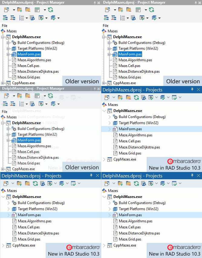
Dockable windows (here the Projects view, renamed from Project Manager):
Note that the title bar is much easier to read: it has a solid background, and the text can be clearly read. It is also taller, so is easier to click and drag to move its position. Inside the Projects view, the toolbar is now a single row (all settings are still available via a dropdown), and you can see each element has a full-width selection and a slightly adjusted height, looking considerably cleaner.
The Desktop Layout, Theme, and IDE Insight controls:
Previously, these were located on the toolbar like any other control. In 10.3, IDE-wide search is in the title bar, a common convention today, and the layout and theme controls, because they affect the entire application, are also located in the title bar.
Code editor tabs, showing the old ones vs the new tabs in 10.3:
Note that the caption is much more readable (white text on a dark background); the tab is slightly taller, so easier to click; and each tab can be closed through an X button.
Really Nice Tweaks
Clear display of focus – an example of one of the areas indicating the care and attention to concrete usability shown in the updated UX.
It’s easy for keyboard focus to get lost, especially in an IDE where you interact with both the keyboard and mouse.
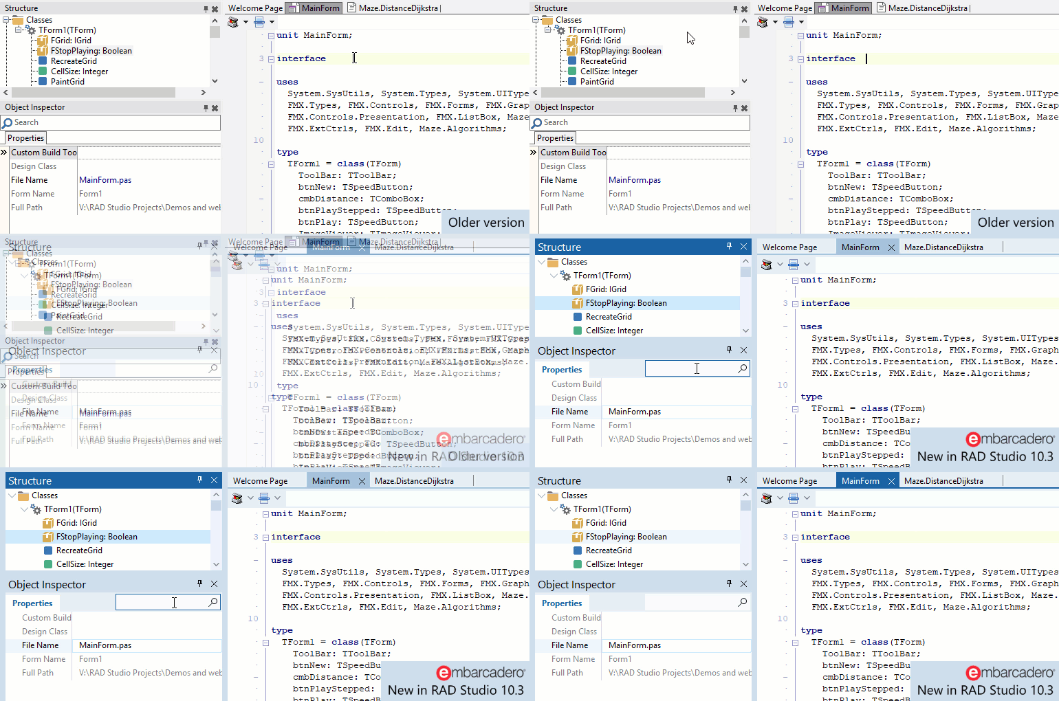
In this animation, you can see how the title of any area that has focus (the code editor’s tab, or the title bar of a docked window when that window has a focused control) is drawn differently when focus is somewhere inside it. This carries across to other windows too, such as the CPU view.
Note that selected items are still drawn even when their control is not focused, just in a dimmed color – keeping the information (what is selected) visible, and also showing whether the control is focused or not.
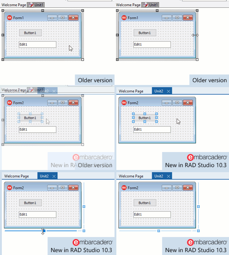
The VCL designer:
Another example of a change made to take care of and polish the IDE. In 10.3, the unused drag bars to the top and left of the form have been removed, and the resizing drag bars on the bottom and right draw in a much more modern style. The most common resizing action you perform with a form is to resize in both dimensions at once, and previously this required clicking on a tiny 7x7px square to drag. In 10.3, this area is much larger. The drag bars are also interactive, reacting to a mouseover, as are the VCL control’s drag handles.
Functional Improvements
There are some great tweaks to functionality in RAD Studio 10.3 as well.
The Documentation tab, introduced in 10.2.1, has been removed and integrated back into the Welcome screen.
The Startup Layout, the layout shown when the IDE is first run or has no projects or files open, is now customizable. In fact, the IDE Options dialog now has a page for choosing the layouts to use for each state the IDE can be in: Startup, Default (when coding), and Debug (when debugging.)
New Light and Dark Themes
 View full size |
Light ThemeIn 10.3, we have introduced a new Light theme to complement the dark theme. This theme uses various shades of blue, and is visually much more pleasant than the gray of previous releases. |
 View full size |
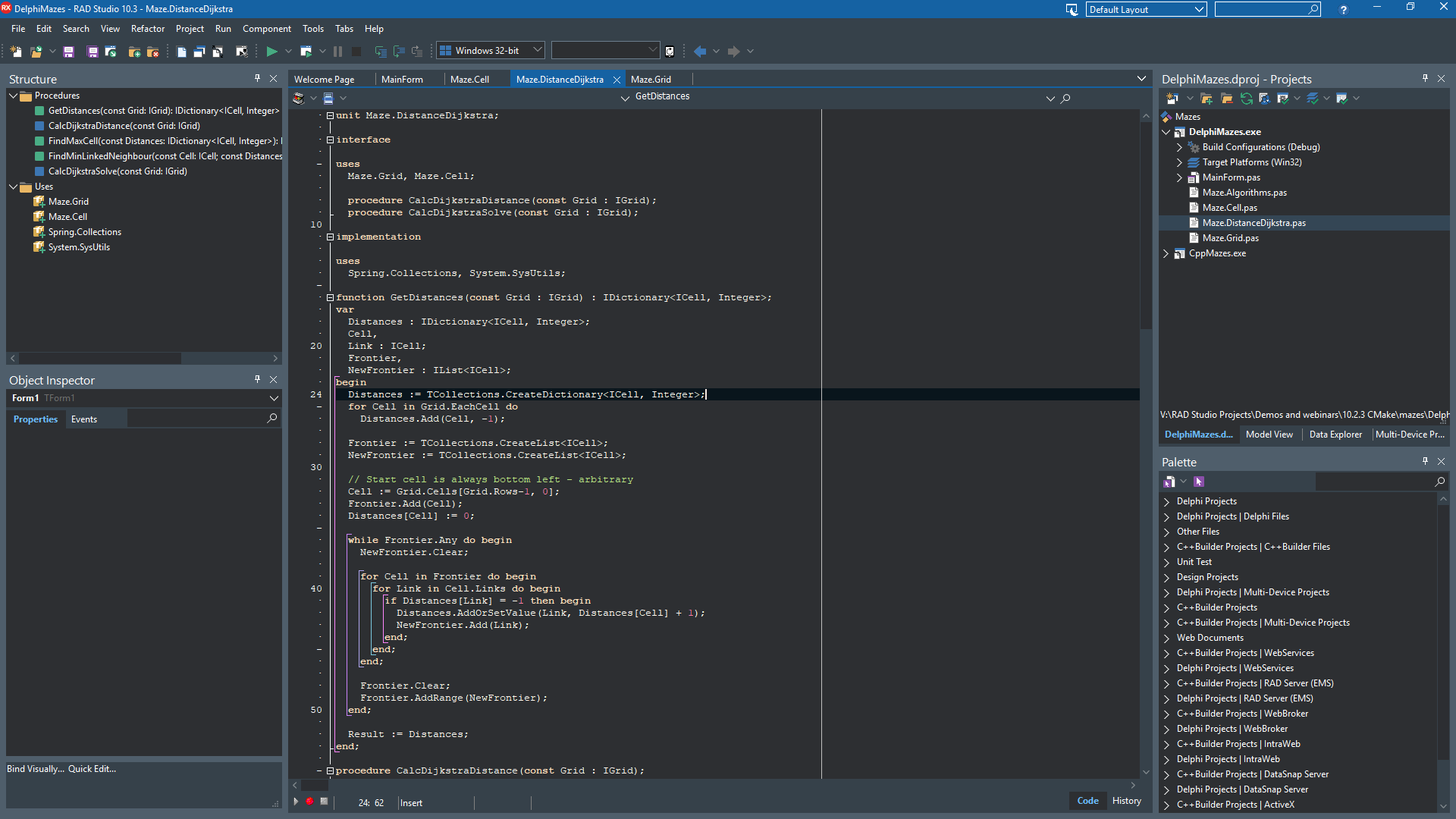
Dark ThemeWe originally introduced the dark theme in RAD Studio 10.2.2. In 10.3, it uses very similar colours, but takes design cues from the new Light theme. We use the IDE daily in-house, of course, and I personally find that this version of the dark theme is one I keep returning to for long-term work. It is very pleasant on the eyes, and very easy to use for long-term use. |
Overall
We’ve paid a lot of attention and care to the IDE in this release, 10.3, focusing on polish as well as solid usability with an eye to making it a pleasure to use.
The UI changes make the IDE immensely better looking, both in design and including new Light and Dark themes, and with a lot of care taken adjusting rendering and layout, and introduces functional improvements too.
This is only the first blog post, with more to come focusing on other areas in the IDE. We hope you’ll love it, and we can’t wait until we release RAD Studio 10.3!
