In RAD Studio 10.3, we’ve greatly improved the look and feel of the main window and IDE and Project Options dialogs. Some highlights are a cleaner modern look and updated dark theme in the main window, and some organisational changes and addition of dialog-wide search in the Options dialogs. Our aim is to make minimal changes in layout, ie allow you to keep using the habit and expectation you’ve built, but make the IDE much more pleasant to interact with over the course of a day, and provide a better first impression for new or returning users.
But revising the main window and Options dialogs is not the only UI work we’ve done to improve the experience of using RAD Studio in 10.3. We’ve also revised several other key dialogs.
GetIt Package Manager
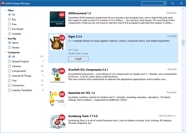
The GetIt Package Manager is a central point to download and install libraries, components, and more. You can also tie dependencies to your project settings, allowing you to install a package as a prerequisite when opening and building a project.
In the past, GetIt loaded and showed results on a page-by-page basis.

In 10.3, GetIt has a cleaner look and feel, retaining a familiar layout. It also now shows results in a scrolling list, making it far more similar to app stores or other similar interfaces, and much quicker to scroll through and to browse packages or to find a package of interest. You can also always read the package description. This is an example of a layout change that makes the dialog much more consistent in style and interaction to other dialogs.
New Items
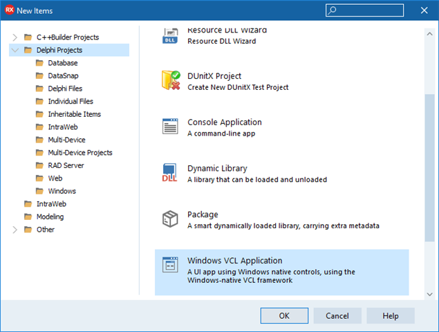
Sometimes you want to create a specific type of project or file, and you do so by clicking File > New > Other. This opens the New Items dialog.
In RAD Studio 10.3, we’ve revised this dialog to take design cues from other parts of the IDE, such as putting the Search box in the title bar. We’ve also made some small changes to the categories shown on the left, and items can belong on multiple categories: for example, a new Windows VCL application is now both in the main Delphi and C++Builder groups, and in the Windows subcategory, which shows all projects applicable to Windows.
A few items have also been renamed to make them more easily understandable: “Windows” has been added to the description of a VCL app, for example, since people new to Delphi or C++Builder may not immediately associate VCL with Windows.
Compile
One of the smallest changes, but also one of the nicest in the sense of a subtle change for usability, has been to the Compile dialog.
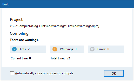
The Hints, Warnings and Errors labels now have a small icon next to them. The neat thing is that this icon lights up when the number of hints, warnings or errors is non-zero, meaning you can immediately see the compile status.
Here, you can immediately see that there are some number of hints and warnings but no errors,
without having to read to see if there is a non-zero number. This is especially useful as compiling is in progress.
One further change is that in the past, the text such as ‘Warnings’ and the number of warnings weren’t visually connected – it was easy to scan left to right and misread. In 10.3, these are placed on their own visually distinct panels.
Overall
The changes in these dialogs are smaller than the revisions in the main window and Options dialogs, but are also great improvements to the look and usability of the IDE. We hope you like them!

