In RAD Studio 10.3, we’re making a number of great improvements to the user interface and usability. Concretely, that’s not just looks: we are carefully making improvements in how to interact with the IDE. Last week, we looked at changes in the main window, where it is much more pleasant to use for long-term (eight-hours-a-day) use, as well a usability improvements like code editor tabs being readable and easier to click. There’s lots more – I encourage you to read the post. (Hey, it has embedded videos!)
But although the main window is the area you spend most of your time, there are other key dialogs in the IDE that are also important. Two of these are the IDE Options and Project Options dialogs.
Options Dialogs
The options dialogs in 10.2.3 and earlier used an older design style – one showing the legacy of growth over a couple of decades. They were grey, and options were often placed in pages without much consideration for the relationship between different options. Like the main window, this could be neatened, to look better, and when related options affect each other, good UI design could be employed to make the indication clear.
There were also a few bugs that we wanted to resolve: the options dialogs, especially the Project Options, had a large fixed height that was not good for users on some laptops; and for users of RAD Studio in other languages, such as French, German and Japanese, sometimes the layout of controls truncated translated text. We care about our users who prefer not to use English, and we want to give you a better experience.
Combining this with the desire for a generally more polished UI, and we have a concrete set of changes. In RAD Studio 10.3, the Options dialogs:
- Have removed lines and borders, like the main window
- The tree on the left has a full-width selection, like the trees in the main window
- The dialog is not gray, but white (or dark-colored, in the Dark theme)
- Group boxes no longer draw with a rectangular box, but as a title with a single line.
- Each page on the right now has a caption, the same as the selected item in the tree, which makes it more clear what options category you’re looking at
These changes alone made a huge difference in the look of the dialog, making it much more clean to look at.
We’ve also made some changes to the UI design itself:
- In general, captions are placed above the control it refers to, not to the left of the control. This means there’s more space, and that means translated text has room to be displayed
- We have sometimes rearranged controls to indicate their relationship to each other
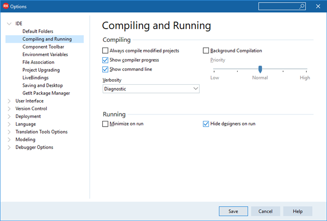
Here’s how the new dialog looks:
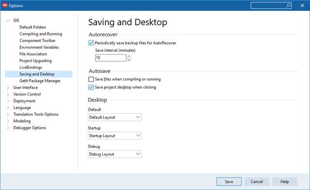
In this screenshot, you can see the same UI look and feel as in the main window, with full-width selections in the tree, and reduction of lines. The page has a caption, and you can see that the individual captions for each control are placed above the control, allowing space for wider translated text.
This dialog is also resizable, and in this screenshot is in fact smaller than the default size in 10.2.3.
Related Options
Many options and controls in the Options dialogs do not stand alone. Changing one can affect another, or one setting can only apply if another option is chosen.
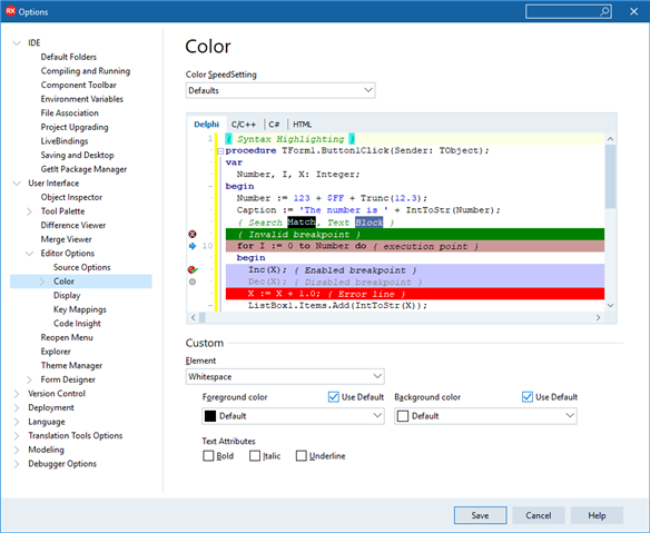
In RAD Studio 10.3, we have ensured that these relationships are visually indicated. A great example is the code editor color settings.
The editor has a number of preset color schemes (SpeedSettings). Choosing one affects the values shown in every other control on this page, because if you change the scheme, not only does the preview change, but the colors and options for each element (such as whitespace, in this screenshot), also changes.
In 10.2.3, this wasn’t clear – the speed setting and all formatting options were all combined. In 10.3, the speedsetting is right at the top, as a kind of heading, and the custom changes are all the way at the bottom of the page.
But there’s a second kind of relationship between controls: the color and formatting options all apply to the element chosen in the Element combo box. That is, they are dependent controls – what they show, and what they control, depends on the value in the Element control.
In 10.3, settings like these are indented underneath the parent, or owner, setting. In this screenshot, you can see how all of the formatting options are indented about twenty pixels from the left, underneath the Element control. This UI convention applies almost everywhere in the Options dialogs, and should make the relationship between settings much more clear.
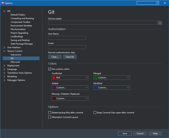
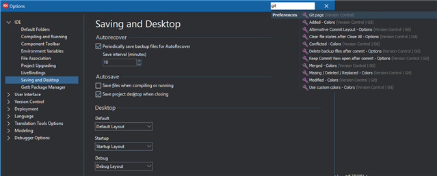
Here in the git settings, this time in the Dark theme, you can see that the colors are indented underneath the ‘Use custom colors’ checkbox. These settings only apply if that checkbox is checked, and so are indented.
Note that on this page, the settings have been reordered. What’s the most important thing to get git working? Locating the executable, closely followed by setting up authentication. Those are now at the top. This is another example of the kind of review work we’ve done in 10.3.
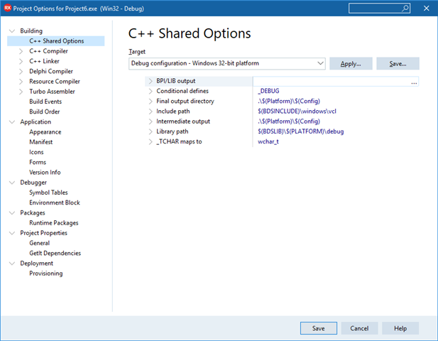
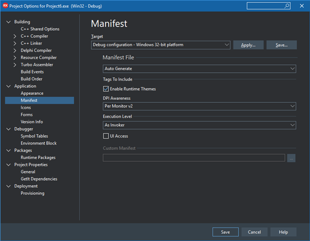
This same indentation convention applies in the Project Options, where many settings are affected by the build target, or are different for each build target. So, they are indented underneath the Target combo box:
You will see this throughout the Options dialogs: dependent settings are indented.
Better Organisation and Search
RAD Studio is an enormous product. There are over a hundred and ten pages in the main Options dialog alone. Many of these have grown over time, with more and more settings being added to each category.
We generally try not to make changes that move the location of items (whether controls or settings) because of the value of habit and being accustomed to where to find something. The main window work in 10.3, for example, moves exactly two things (IDE Insight and the desktop layout controls) to the title bar. The rest is exactly where it is in 10.2.3, only much better aligned.
Sometimes moving items makes a concrete improvement, and some options fall into this category. We’ve found that many users find it very difficult to find some options, even if they are very familiar with the product and have used it for many years. We’ve made a number of changes in both both IDE and Options dialogs to make it easier to find settings, by introducing new categories and new pages in the dialogs with better names.
In the main IDE Options, we introduced two new top-level categories in the dialog, IDE and User Interface, each of which has some new categories inside. The IDE category contains settings that affect general IDE behaviour. The User Interface category contains settings that affect general user interface or visual settings.
In 10.2.3, there were a large number of settings in Environment Options, and those have been split up into better categories. For example, Compiling and Running has settings about, well, compiling and running. Then, settings about the desktop layouts, and saving, which are related because you can save the layout when closing the project, are in their own section.
The idea is that if you know the setting you’re after, the new categories will make it easy to find. For example, Is it a visual setting? It will be in User Interface.
In the Project Options, we made some similar changes. First, in 10.2.3, all build tool options were scattered throughout the tree on the left – compiler, linker, resource compiler, none were collected together. In 10.3, we have a new Building category which contains all the build tools:
Here, the C++ options, C++ compiler, linker, Delphi compiler, resource compiler, assembler, build events, and built tools, are all grouped together.
You may also notice the new subcategories under the Application category. In the past, many settings were all placed on the Application page. (In fact, the number of potential options on this page was one reason the Project Options dialog was unable to be resized smaller vertically in 10.2.3, because for some applications, there were a lot of settings on one page.) In 10.3, we’ve moved some of these out to sub-pages. For example, here are the Windows manifest settings in 10.3:
In 10.2.3, these were in the Application page; in 10.3, they are split out into their own page. Similarly, the new Icons page contains icons and other imagery (such as splash screen images for mobile.)
Like the main Options dialog, we hope these new categories will make it easier to find options. When you know what you’re looking for, the category names are aimed to be understandable and clear so you can correctly intuit where the settings will be.
Dialog Search
But what if you don’t know what you’re looking for, or if the category names aren’t explanatory for you? We’ve added dialog-wide setting search in both the IDE and Project Options.
This uses the same search system as IDE Insight (the search for the whole IDE, located in the main window’s title bar) and searches within the current dialog. For example, to find the colors for git integration, click in the title bar search and type ‘git color’. You will be shown a list of results and choosing one will take you to the page with that setting.
Like the main window, the search is located in the title bar; this is a convention we’ve added for all windows, that if there is search, that’s where you’ll find it. (Consistency is important.)
Overview
There are some great changes in RAD Studio 10.3, aimed at both improving the look and feel of the IDE, and also at concrete usability, making it easier for you to interact with the IDE and find, understand, and change the settings you need. The Options dialogs have a clean new feel, and the options have been laid out to highlight important options and make the relationship between different settings clear, including indenting settings. Some new categories have been created, and settings search has been added to both Options dialogs.
RAD Studio 10.3 will be out very soon, and we’re very much looking forward to it!
