Over 20% of users abandon an application after using it the first time (per Localytics). How can you design your mobile app to avoid being one of these casualties?
Start out by designing your application with mobile in mind. You can’t just replicate your desktop application and expect it to make sense on a smaller form factor.
Each platform already has existing patterns your users are used to: iOS tab bars are on the bottom and include glyphs but Android tab bars are at the top and are text-only. When you design apps that conform to user expectations, it’s easier for them to learn your app and they’re less likely to quit out of frustration. Compared to more full featured desktop applications, mobile apps should be easy to use, require limited instruction or tutorials and sign up forms (if required) should be simple so users can start using the app right away.
Make your next mobile app easy-to-use by understanding when to use these FireMonkey navigation options.
Optimizing your UI for Touch
Swipe gestures for navigating between screens
This is a very common paradigm in mobile apps. Your users will naturally try to swipe right to move to the next screen and swipe left to navigate to the prior screen. With FireMonkey, it’s easy to implement this functionality and we provide some great gesture demos in our Samples directory.
In addition to adding a back arrow in the top left side of your screen for navigating back, implementing a swipe left gesture to perform the same action improves application usability. Adding an animated transition as the user navigates between screens is also nice touch and provides an additional visual cue to the user.
Pinch and zoom
This should be used sparingly, and only for specific purposes. While commonly used with images, this is also very helpful in business applications for zooming in on documents.
Standard User Input Patterns
Shifting the form on keyboard focus enables the user to easily fill out forms without the input boxes being covered. Another tip is to not put too many user input controls onto one screen. For example, a sign up screen is better spread out across a number of categorized screens (i.e. personal information, employment history etc.) than one long screen that requires the user to scroll extensively.
Mobile Navigation Design Options
Toolbar Only Navigation
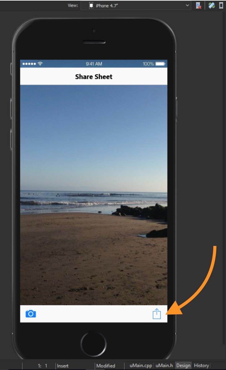
Toolbar only navigation is commonly used for single screen apps. A common use case is a simple image editor that allows you to load an image, apply effects and then share the image. A mobile optimized enterprise app could also consist of a single screen, allowing the user to load company documents, sign them and then share the PDF with the various stakeholders.
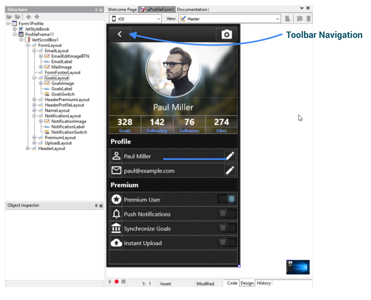
On Android specifically, overflow-style popup menus are still commonly used, although that is not something you frequently see on iOS. Toolbar navigation can also be used in conjunction with a tab control for multi-screen navigation, and generally consists of text or glyph buttons.
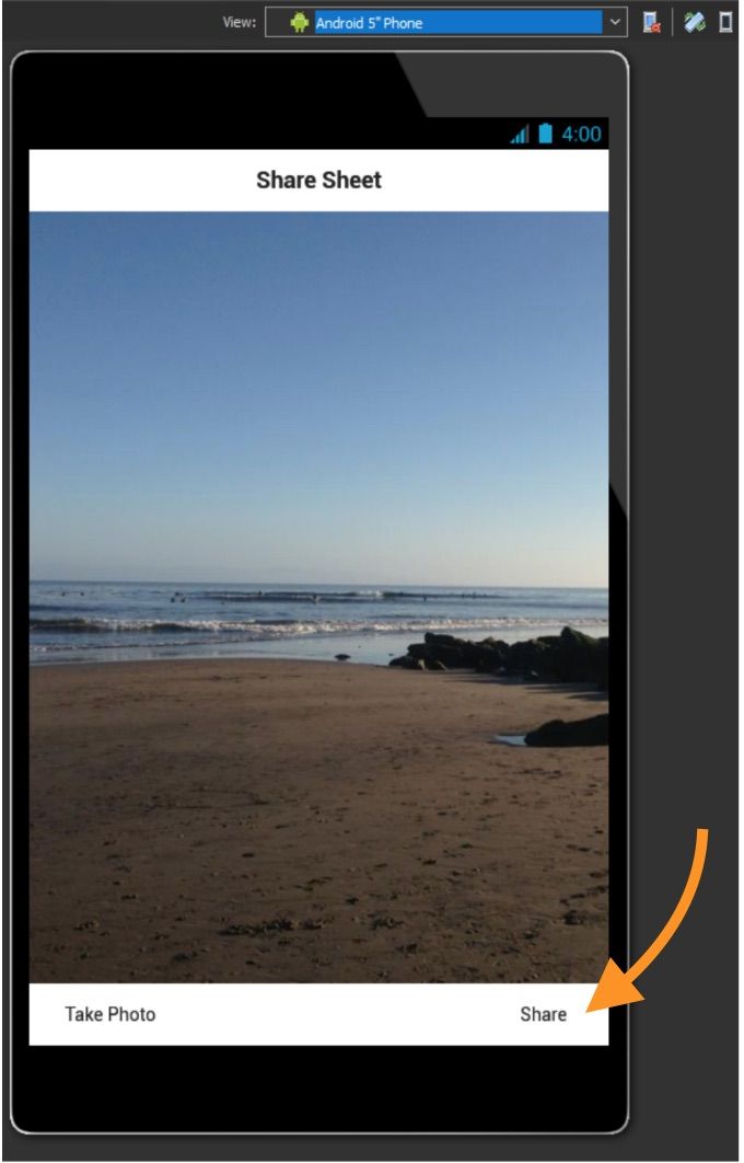
Shown: Share Sheet sample application with toolbar navigation, found in the Mobile Snippets Samples directory
Shown: Profile Screen FireMonkey GUI Template with toolbar navigation, found in GetIt (Tools > GetIt Package Manager) in the IDE
Tab Bar Navigation
Tab Bar Navigation is used to divide your application into key focus areas, and generally provides a very intuitive user interface. It’s often used in conjunction with a header or footer toolbar, and displayed with annotated glyphs on iOS and text on Android.
FireMonkey's Behavior Service is a service API that allows the framework and developer to query information about the device the app is running on to dynamically adjust itself for the form factor and platform. UI element locations are automatically adjusted for each type of target device. On iOS, tabs are automatically shown at the bottom with icons, whereas on Android they’re displayed at the top without any icons (although icons can be shown if desired), matching the different platform standards.
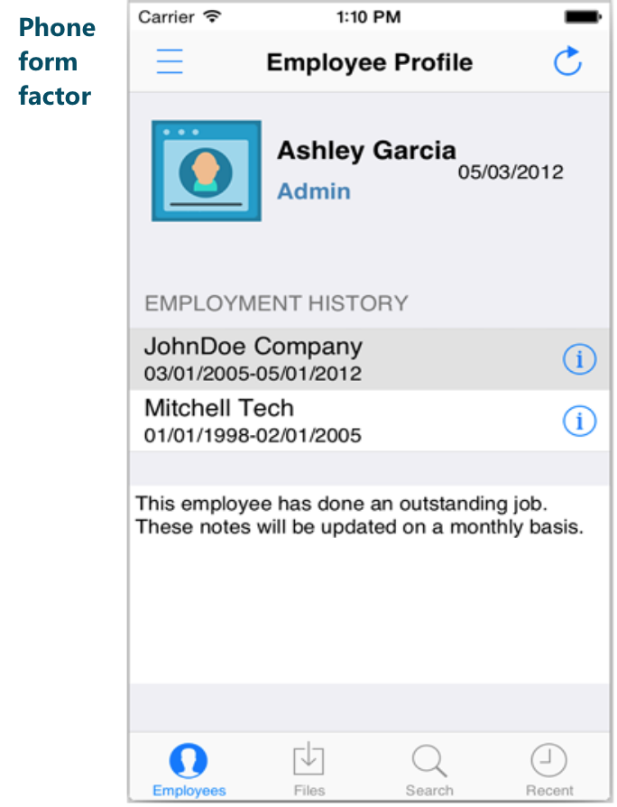
Shown: FireMonkey demo application using a TTabControl with four tabs: Employees, Files, Search and Recent to divide the application into key focus areas.
The recommended number of tabs is 5 or less on a phone form factor to ensure each tab is large enough for fingers (and sometimes thumbs) to select it without hitting the wrong tab.
App “Home Screen” Navigation
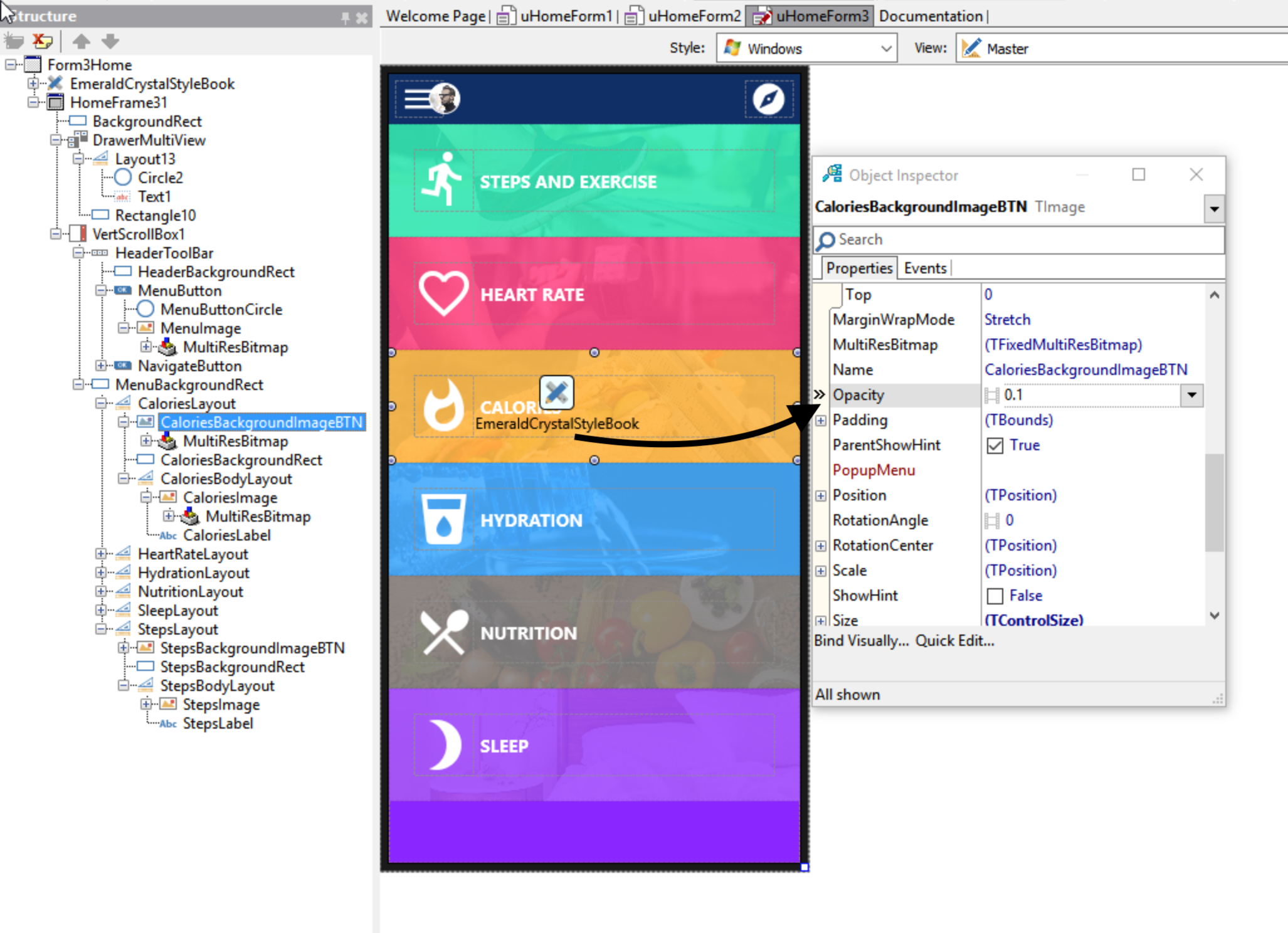
The “Home Screen” layout is a great alternative to tab bar navigation as it presents the key application functionality nicely grouped on a single screen. The home screen design usually consists of glyph buttons arranged in a grid or list layout. Glyph buttons can be annotated with text and sometimes span across multiple screens (with the key app functionality being shown on the first screen).
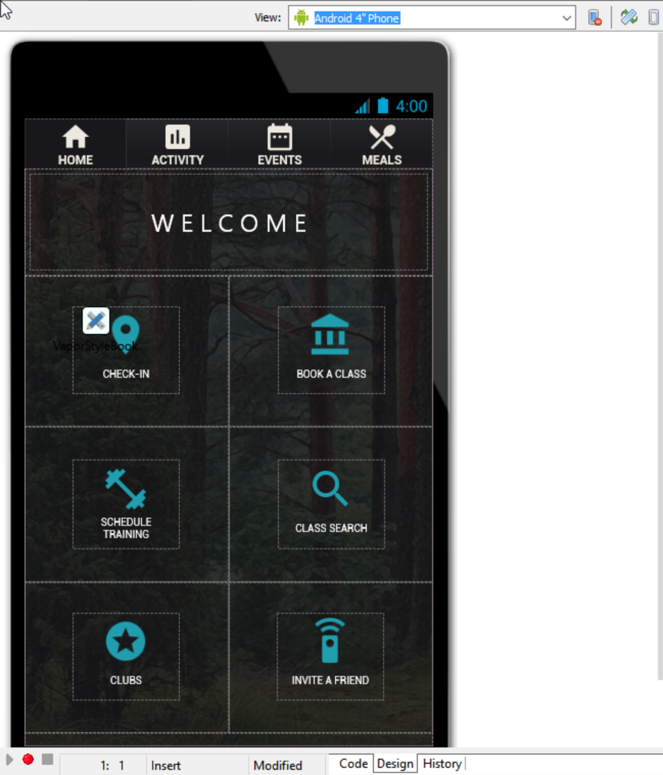
Shown: Home Screen FireMonkey GUI Template with home screen navigation, found in GetIt (Tools > GetIt Package Manager) in the IDE
Drawer Menu
With a slide-in style drawer menu, the main application menu is hidden by default. This allows developers to take advantage of additional screen real estate when building their application. It’s usually invoked by tapping on a menu button and/or swiping left or right.
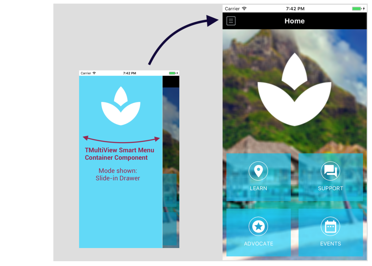
Shown: Home Screen FireMonkey GUI Template with home screen and drawer navigation, found in GetIt (Tools > GetIt Package Manager) in the IDE.
RAD Studio includes TMultiView, a smart menu component. With TMultiView, it is really easy to create app navigation that automatically adjusts itself depending on form factor, orientation and target platform using FireMonkey’s behavior services. TMultiView is a container component which means that you can parent many different components to it, such as a top aligned toolbar or a client aligned listview.
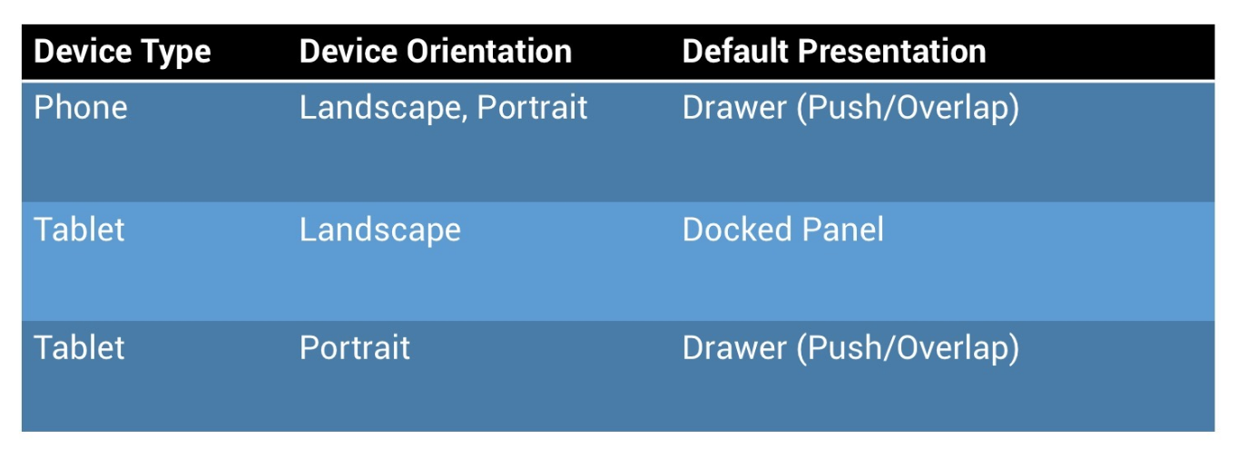
The MultiView component has some default built-in behavior that defines its appearance at runtime based on form factor and orientation. This behavior can easily be changed if needed.
The drawer menu, for example, can overlap with the content shown on the form, or push the content off its current position. You can also define the duration of the sliding drawer. The drawer is automatically invoked by swiping across the screen from either the left or the right side (depending on the placement of the drawer), and you can also hook it up to a button. In landscape mode on a tablet, a left aligned docked panel is shown instead of a slide-in drawer to take advantage of the additional screen real estate.
Summary
-
FireMonkey offers numerous built-in mobile navigation options
-
Design with mobile in mind, don’t try to replicate your existing desktop functionality for a small form factor
-
Each platform already has existing patterns your users are used to – design apps that conform to user expectations
-
Adhere to the platform guidelines to increase your chances of getting your app accepted by the various app stores
Ready to learn more? Watch my ‘UX Excellence: Cross Platform Design Patterns’ webinar replay:
