
TMultiView is a smart menu component for FireMonkey applications that makes it really easy to create app navigation that automatically adjusts itself depending on form factor, orientation and target platform. TMultiView is a container component which means that you can parent many different components to it, such as a top aligned TToolbar or a client aligned TListview.
Depending on device and orientation, the application menu will be displayed as a drawer on smaller form factors, a docked panel for wider screens such as tablets in landscape mode or as a custom menu, such as a popover menu.
Windows 10 introduced a UI paradigm on Windows that has been popular on mobile platforms for a while. A slide-in drawer is now commonly used in Windows 10 applications to show and hide menu items.
For FireMonkey, we added a new menu mode for Windows 10 to the existing TMultiView control to present an animated slide-in drawer on Windows. Combined with the new "NavigationPane" mode, you can use the Windows 10 specific MultiView style elements to easily define custom icons with text that are shown and hidden when the animated menu is expanded or collapsed.
On a related note, we added a new VCL control in the 10 Seattle release called TSplitView to easily add a slide-in drawer to your existing and new VCL Windows applications.
Included in the RAD Studio 10 Seattle release is a great demo showing off the new FireMonkey TMultiView NavigationPane mode.
Object Pascal Demo:
- C:\Users\Public\Documents\Embarcadero\Studio\17.0\Samples\Object Pascal\Multi-Device Samples\User Interface\Windows10NavigationPane
C++ Demo:
- C:\Users\Public\Documents\Embarcadero\Studio\17.0\Samples\CPP\Multi-Device Samples\User Interface\Windows10NavigationPane
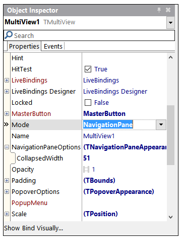
To use the new Windows 10 specific mode, drop a TMultiView component onto your form and select Mode = NavigationPane. You can also define the collapsed width of the slide-in drawer.
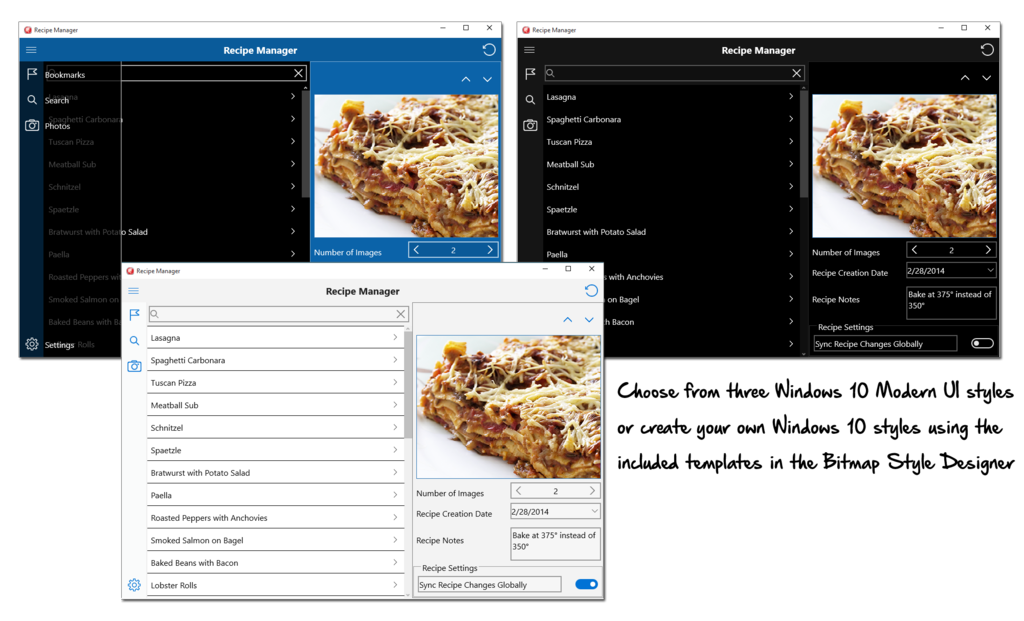
To utilize the new built-in style options for TMultiView on Windows 10, load one of the three included Windows 10 styles using a TStyleBook on your form. You can find the styles under C:\Users\Public\Documents\Embarcadero\Studio\17.0\Styles
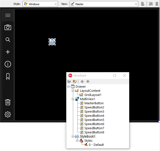
Parent several UI controls to the MultiView component such as TButton or TSpeedButton. Define top or bottom alignments for each button control. In the Object Inspector for TMultiView, set the MasterButton to the TSpeedButton or TButton control that is intended to be your master button. The MasterButton will invoke the slide-in drawer on-click. To style this button as the three line "hamburger" icon, select StyleLookUp = detailstoolbuttonmultiview as the setting. This button does not require a specific name, but it's best to name it Master, or MasterButton, to make it easily identifiable amongst your other UI controls.
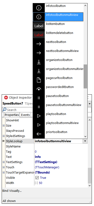
In the StyleLookUp drop-down menu, you will find a range of new style options that were specifically created to be used with the new Windows 10 MultiView mode.
Below is a screenshot showing the new MultiView mode in action with the three included Windows 10 styles: