In RAD Studio 10.2.2, we have a number of UI upgrades (the new dark theme and welcome page and startup). But we have one more which I’m very pleased with and would like to share with you today: we’ve redone the component icons.
Old icons – what’s wrong with them?
Delphi and C++’s component icons have been a mix of styles. Many date back twenty years, and have been partially updated over time, often in a mix of styles and a mix of sizes. (Component icons should come in 16, 24 and 32px sizes for differing display in the Tool Palette or component toolbar and the form designer; not only did we not always have all sizes, but sometimes they looked completely different at different sizes.) In addition, some of the icons didn’t accurately represent what the component actually was. This has bothered me ever since the last redesign about ten years ago.
| Here’s TLabel at the small (16×16) and medium (24×24) sizes.
What is a label in Delphi/C++Builder? It’s a bit of text. What does this label look like? A luggage tag. Yes, it’s a label, but it’s not a Delphi label. This illustrates that when designing new icons, they need to be designed aware of what the component actually is. |
||
|
TActionList (top) and TActionManager (bottom).
Questions these icons raise includes: what is the architect’s drafting triangle in the action manager for – what have actions got to do with drawing? Is there any way to tell, just by looking at these icons, that these components are closely related? Does anything in these icons actually communicate “action”? |
|
| TButton.
These aren’t bad icons – they both look like buttons and are clearly recognisable. But it is odd that they look very different, are differently coloured, at different sizes. |
There are a couple of other problems with these icons. They’re low visual quality: they are not antialiased, because component icons require they use colour-keyed transparency, where the lower-left pixel in an icon is the transparent colour. (That is, transparency is either on or off; there is no alpha channel.) Finally, they all look old – they do not look like icons designed recently.
This gave us a set of design goals for redoing the icons.
New icons
Design goals
From analysis of the existing icons, we came up with several goals. Icons should:
- Look like the component they represent. Where this is not possible, such as for non-visual controls, they should carry the conceptual idea of the component as well as they can.
- One important point here is to be recognisable. Many of our users, including many people reading this blog, have been using Delphi and C++Builder for many years. That means there’s habit when interacting with the UI, and so we need to be cautious about changing it in case it impacts use. Icons are small, but we don’t want to change them unnecessarily. On the other hand, when an icon can be made much better, we should.
- Be related. If components are related in functionality, the icons should have a common theme. For example, all dialogs (already) have a dialog frame and a graphic inside that indicating the function, such as a save icon inside a dialog frame. But other components do not have something similar – all the FireDAC icons look completely unrelated. They should have a common visual key that says, at a glance, “I am FireDAC”.
- Have a clear, modern, bold design. We are working on a number of UI and UX improvements, of which these icons are just one part. We want the icons to be modern, and have an elegant and clear design.
What do they look like?
Here’s what the icons look like in 10.2.2.
TActionList |
TButton |
TColorBox |
TFDGUIxErrorDialog |
TMemo |
TTimer |
TEdit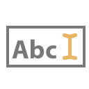 |
TLabel |
TMainMenu |
TOpenDialog
|
TRadioButton
|
TTrackBar
|
These are really nice icons.
Let’s look at these and compare to the design goals:
- Look like what they are. TLabel in Delphi is a piece of text. This is is indeed a piece of text (and is quite similar to the Delphi 7-era icon for the same component.) Other visual controls like TTrackBar and TRadioButton are equally recognisable. Other controls are worth looking at too: TMemo looks quite similar to its old design, but no longer has a folded over page corner – because it’s not a piece of paper, it’s multiline text in a computer UI; TEdit has an edit cursor, not a pencil. Finally, TActionList is worth examining: we thought a lot about how to capture the concept of “action” in an icon that often has to be very small (16x16px!) We ended up going with a movie clapboard, which is the item that is snapped shut just before the director yells “Action!”
- Be related. All dialogs look like TOpenDialog: a dialog frame with an icon inside. All FireDAC icons have the red database symbol. In addition, we use the same icon for both VCL and FMX versions of the same control – a VCL TButton and a FMX TButton are, conceptually, the same thing.
- Clear, modern, elegant design. I love the design of these icons. They are drawn vectorised; scale; use a simple palette of only a few colours; use those colours really well; are clear; and look great.
Also, notice that the icons are not simply the same image scaled up or down. TTrackBar is a good example of this: at each size, the small indicator marks are different. An icon designed for 16×16 or 32×32 won’t resize and scale to look good at 24×24, because the pixel grid is different. Even if we support antialiasing, a 1-pixel-wide line looks much cleaner when it takes up one pixel in the image, rather than being approximated through antialiasing over several pixels, which makes it look blurry. Similarly, shape edges should be snapped to the pixel grid for each size. We’ve gone through and tweaked the icons for each different pixel grid.
Dark theme
In 10.2.2, we also introduced a new dark IDE theme. What do these icons look like?
TActionList |
TButton |
TColorBox |
TFDGUIxErrorDialog |
TMemo |
TTimer |
TEdit |
TLabel |
TMainMenu |
TOpenDialog
|
TRadioButton
|
TTrackBar
|
Above is the same table over the dark theme’s background colour. As you can see, the icons have good contrast (the strong palette helps) and even the grey colour is clear and visible against both the light and dark backgrounds.
In the IDE
Or view this screenshot at full size.
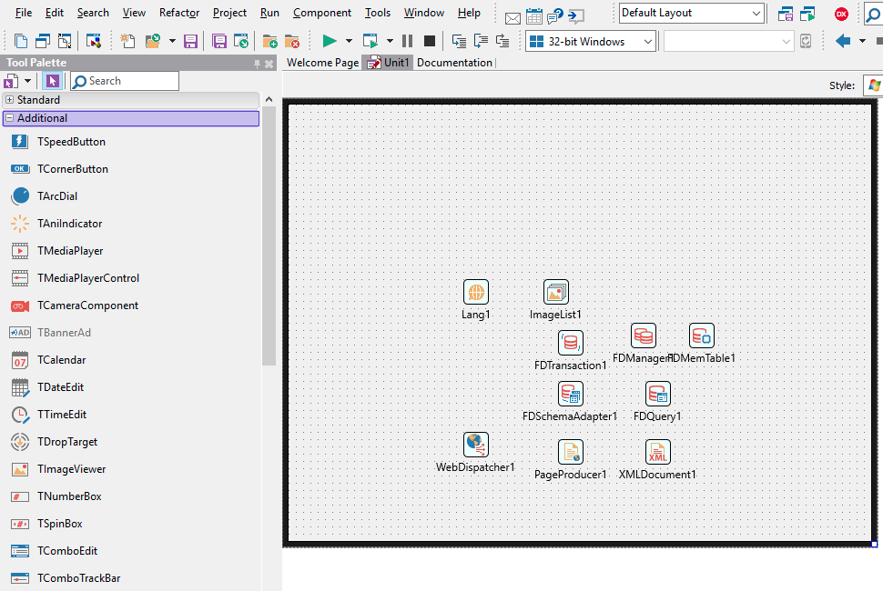
This screenshot shows many more icons, and you can also see how related icons (such as the FireDAC ones dropped haphazardly on the form) can be seen to be related.
Technical details
Finally, what does this mean for you if you are a component developer? You might find this section interesting even if you don’t create your own components, because of what it means about where the IDE is heading.
Bitmap and PNG
Component icons can be both bitmap and PNG format. The new icons are all alpha-transparent and antialiased. They can either be a PNG image, or a 32bpp bitmap (non-premultiplied-alpha.)
If the bitmap is 32bpp, the IDE assumes it is a new-style icon and has a valid alpha channel. (During testing, we saw a few icons that were 32bpp bitmaps, but with an alpha channel that was 100% transparent. If you ship icons like that, your icon will come out as fully transparent.) If the bitmap is any other format, such as 24bpp, it assume it is an old-style colour-keyed icon. This gives full backwards compatibility, so old-style component icons will still work.
If you want to use a PNG instead of a bitmap, the resource names are the same, but suffixed “_PNG” and stored as a RCDATA resource, not a BITMAP resource. So TLabel’s 32×32 icon, as a resource script using a PNG image, would be:
RCDATA TLabel32_PNG "tlabel32.png"
Backwards compatibility
If you use 32bpp bitmaps, IDEs earlier than 10.2.2 won’t display the icons correctly. There are two ways to handle this:
- Build different resource sets for component packages targeted at a recent IDE. We recommend this starting in 10.3 – that is, your component package for 10.3, which would be a different project and package than for 10.2.x, could store different resources
- Leave the existing old bitmaps, and add new PNG resources. PNGs are loaded preferentially to bitmaps, so if you have an (old or new!) bitmap icon, and a new PNG icon, 10.2.2 will load the PNG. Older IDEs are unaware of the PNG resource, so you can have two sets of icons in the one component package.
Performance
Our testing showed that loading bitmaps was faster than PNG images. For the components we ship with the IDE – about 700 components, with three image sizes – using PNGs would have added about a second and a half to the IDE startup speed. For this reason (and by the way, we have very fast IDE startup time in 10.2.2) we’ve gone with 32bpp bitmap images for 16, 24 and 32px icons.
You can use either bitmap or PNG, but if you have a component package with many components, please be aware of the impact on startup time if you choose PNGs.
Our guide is: Use PNG if you want very easy backwards compatibility, or small file (BPL) size; use bitmaps if you want fast loading. We use bitmaps for 16, 24, and 32px icons, and PNG for the 128px icons. Speaking of which…
What are those 128px icons above?
The icons displayed above show 16, 24 and 32px icons… but also a much larger size. They are 128×128 versions of the same icon.
If you look in our component packages you will see 128px versions of the icon for each component, as a PNG resource. We ship them, but we do not use them yet. These icons are looking ahead towards a high DPI IDE. We use PNG for ours because at about 64x64px, the balance between speed loading and file size for large images tips – having 128px icons as bitmaps would significantly increase the size of the packages.
To add these yourself for your own components, add a “128” suffix for the names of the icon resources: eg, “TEdit128” (bitmap) or “TEdit128_PNG” (PNG).
Color swatches and style
We’d like to encourage you to update your icons in your component packs. You can, of course, use any style you want, and we hope being able to have antialiased icons with true alpha transparency will let you create great-looking images. However, if you want to design icons that fit in with our visual style, we definitely want to encourage you to do so.
| Blue | ⬤ #3d78b2 |
| Red | ⬤ #cb4c32 |
| Yellow | ⬤ #e8b564 |
| Green | ⬤ #4d9f7d |
| Violet | ⬤ #8a529f |
| Gray | ⬤ #787878 |
You can see examples of the style above, and of course in the IDE itself. If you are a tech partner or MVP, we can even provide you with a copy of all of our icons, including the original Illustrator files and a document going into detail about our design process.
Overview
These new component icons are a fantastic visual improvement in the IDE.
We hope you find them as clear and well-designed as we’ve aimed for, and we would like to encourage you to update your icons and make use of the new antialiasing and alpha transparency support!

