This week there was another blog post by David I about the availability of the new great looking mobile FireMonkey InfoPower grid component for registered Delphi XE5 users and also a demo app available at Google Play Store. I have immediately installed this demo app on my Nexus 7 Android device to show it to programmers in Bratislava. A very nice option in the demo is a possibility to switch between FireMonkey styles at runtime.
I just could not resist building a quick demo app that would mimic the style switching behaviour of the InfoPower demo app:-)
When you install RAD Studio XE5 or Delphi XE5 there are also installed custom styles that you can use in your projects. By default you can find custom style files in C:\Users\Public\Documents\RAD Studio\12.0\Styles\ folder. There is "Dark" custom style for Android and "Black" and "Transparent" custom styles for iOS. Beyond these styles registered Delphi XE5 users can also download and use "premium" styles that are available as a separate download ("FireMonkey XE5 Premium Style Pack Is Now Available"). This will add "Jet" and "Diamond" styles for both Android and iOS to the mix. To make my life easier I have copied these premium style files to same folders as pre-installed styles.
Now I need to give a try. Instead of starting from scratch it is easier to adapt and extend an existing app that already has different types of mobile controls to see custom styling in action! The best demo for this is "MobileControls" project that is installed as part of Delphi XE5 install. In default installation you can find it in C:\Users\Public\Documents\RAD Studio\12.0\Samples\FireMonkeyMobile\Controls\ folder.
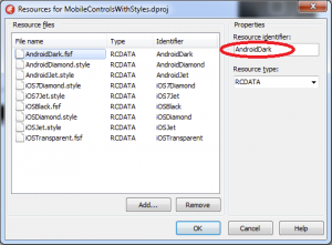
The first thing to do is to add all custom styles to this project as resources.
I have added all available styles to the project. The very important step here is to make sure that the "Resource Identifier" of every style matches exactly the filename of the style, because in code I'm going to refer to resources through their identifiers.
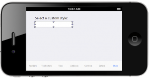
The "MobileControls" demo project contains main TabControl component with a number of tabs that showcase different types of mobile FireMonkey controls. Just right-click on the "TabControl1" and select to add a new "TTabItem". I have the "Text" property of this new tab item to "Styles" and added a TComboBox component that I have named "ComboBoxStyles".
In the form's "OnCreate" event I need to add code to populate this combo box with different styles depending on the platform for which this project will be compiled. There are different styles for Android and different for iOS!
I also need a event handler of the "OnChange" event for the combo box to load a different style from a resource. You also need to make sure to add "FMX.Styles" unit to the "uses" clause of the form. I have ignored iOS 7 styles for time being. There is also a small helper function "AddComboItem" that adds an item to combo box with a given text.
uses FMX.Styles;


procedure TForm1.AddComboItem(AText: string
var lbi: TListBoxItem;

begin

  lbi := TListBoxItem.Create(ComboBoxStyle);

  lbi.Parent := ComboBoxStyle;

  lbi.Text := AText;

  ComboBoxStyle.AddObject(lbi);

end


procedure TForm1.FormCreate(Sender: TObject);

begin

  AddComboItem('Default'


  if TOSVersion.Platform = pfAndroid then

  begin

    AddComboItem('Diamond'
    AddComboItem('Jet'
    AddComboItem('Dark'
  end

  else if TOSVersion.Platform = pfiOS then

  begin

    AddComboItem('Diamond'
    AddComboItem('Jet'
    AddComboItem('Black'
    AddComboItem('Transparent'
  end


  ComboBoxStyle.ItemIndex := 0; // make sure "default" style is selected at start-up

end


procedure TForm1.ComboBoxStyleChange(Sender: TObject);

var resname: string
begin

  if ComboBoxStyle.ItemIndex > 0 then  // first item is "default" style

  begin

    if TOSVersion.Platform = pfAndroid then

      resname := 'Android'

    else if TOSVersion.Platform = pfiOS then

      resname := 'iOS'


    resname := resname + ComboBoxStyle.Selected.Text;


    style := TStyleManager.LoadFromResource(HInstance, resname, RT_RCDATA);


    if style <> nil then

      TStyleManager.SetStyle(style);

  end

  else

    TStyleManager.SetStyle(nil// set the "default" style

end
Save All. Now we can run this project on Android and on iOS to see the styles in action!
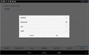
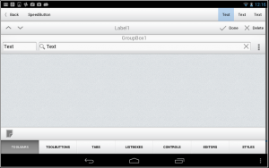
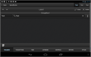
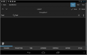
Let's start from Android. This is how my demo looks on Android. Select the style first.
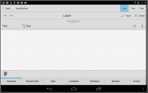
Android Default style:
Android Diamond style:
Android Jet style:
Android Dark style:
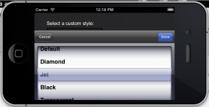
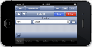
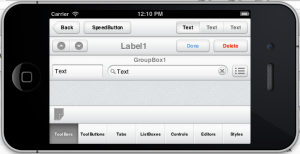
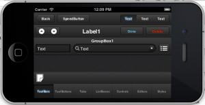
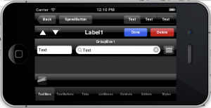
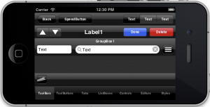
Now let's try with iOS! This is how our app looks in the iOS Simulator. Select style first!
iOS Default style:
iOS Diamond style:
iOS Jet style:
iOS Black style:
iOS Transparent style:
That's really powerful! Building mobile apps with Delphi XE5 is pure fun.
