Last time we have talked about the importance of app architecture and layers of code. David went one step further and started to build user interface for our calculator apps. This week I'm going to catch up and we will discuss designing user interfaces (UI) for our apps.
VCL and FMX
Clearly user interfaces are of the highest importance for the user experience (UX) of our app. In Delphi there are two libraries for building user interfaces. There is the Visual Component Library (VCL), which is probably the best way for building great applications for Windows. It was there since Delphi 1 and is being constantly improved and updated to support the latest Windows features including upcoming support for Windows 10 Anniversary Edition. The second library is FireMonkey (FMX). It has been designed from ground up for building user interfaces for all major desktop and mobile operating systems, including Windows, Mac, iOS and Android. In this series we are focusing on using FireMonkey as Delphi Community Edition allows you to build applications for Windows but also for mobile platforms.
The key benefit of Delphi and FireMonkey as that you can design your app once and from the same codebase you can natively compile for different operating systems, different form factors and orientations. That is a unique capability on the market today, but it also poses new challenges. How do you design your user interface so it is useful and looks great on different devices?
FireMonkey Advantage
Desktop and mobile user interfaces differ quite a lot but FireMonkey provide common abstractions that you can use to target different platforms. For example the "OnClick" event that we traditionally use to assign code to clickable controls like buttons also work for touch events on mobile where there is no mouse. Another difference is the fact that user interfaces (or in other words forms) are always displayed "maximized". On desktop the end user can resize the form, having it to occupy the whole screen or only its part. On mobile it is always "maximized" and the size of the form is the same as the size of the screen. However the user can change the orientation of the screen. In Project Options of your app you can decide which screen orientations your app is designed to support. By default all four orientations (two horizontal and two vertical). In terms of FireMonkey cross-platform abstractions you can programmatically react to changes in orientations in the "OnFormResize" event.
One of the key foundations of FireMonkey GUI library is the fact that different visual controls can "own" other controls. You can quickly see this parent-child containment relationships in the "Structure" view in the top left corner of the IDE. With a mouse you can drag controls to change their parents.
When visually designing user interfaces you can use properties of different components to control how they are going to position themselves within their visual containers. One of the most important properties is "Align", which let you control alignment of a control. For example if you "Align" property to "Client" the control will occupy the whole available space. That's important because it will work regardless of the size of the device screen. You can also align to "top", to "bottom", "left", "right" and so on.
Using Layouts
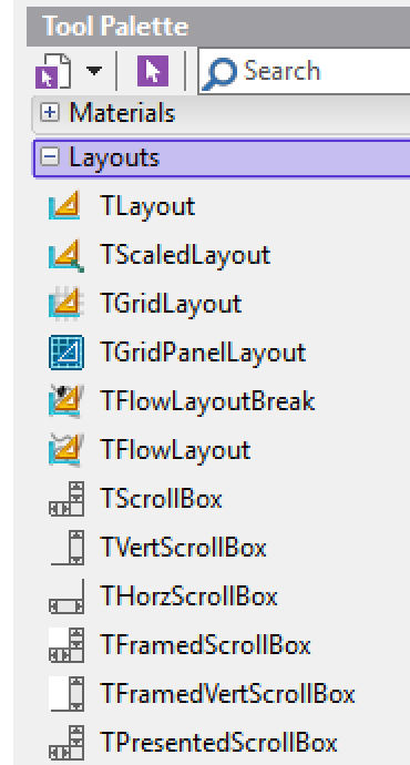
When building user interfaces that need to look good at different form sizes, it is a good practice to group controls within a parent. Obviously you can use visual controls like "TPanel" for grouping, but in FireMonkey there are also layout components that do not have any visual representation at runtime. Their sole purpose is to group other visual controls. You can see different available layout controls in the "Layouts" category in the "Tool Palette".
The Calculator User Interface
In this blog post we are going to build the user interface for our simple calculator applications. The design of our app has mobile targets in mind. On mobile different user interface elements need to be big and there must be big spacing between them.
In the second post of the series, we have created “DelphiSuperCalculator” project that we are going to develop further today. The main form of the app is stored in the “uFormCalculator” unit. We need to have a clean slate. Double-click on the button that was added to the form last week and remove the one line of code that calls “ShowMessage”. If you save the form now, the empty “OnClick” event handler will disappear. Now turn back to the form and delete the button.
Now let's add the new features to it. Click somewhere on the form to select it and change its “Name” property from “Form1” to “FormCalc”. Change the “Caption” property of the form to “Delphi Super Calculator”. Save All. Now we have a good starting point to work on our user interface.
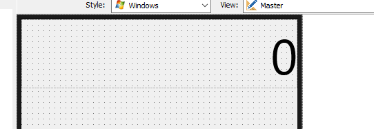
Change the "Width" of the form to "400" and "Height" to "500", so it looks like a phone-sized user interface. Drop on the form "TLayout" component. Change its name to "LayoutDisplay", For chancing the name of a component, you can use the QuickEdit common of the local menu (right click on the component):
Align the layout to the "Top" and change its "Height" to "100". This will be a place for our display. Drop a label on this layout. Align it to "Client". Change its "Name" to "LabelDisplay" and its "Text" property to "0". Expand "TextSettings" property, change the size of the font to "72" and the "HorzAlign" to "Trailing". Now it looks good:-)
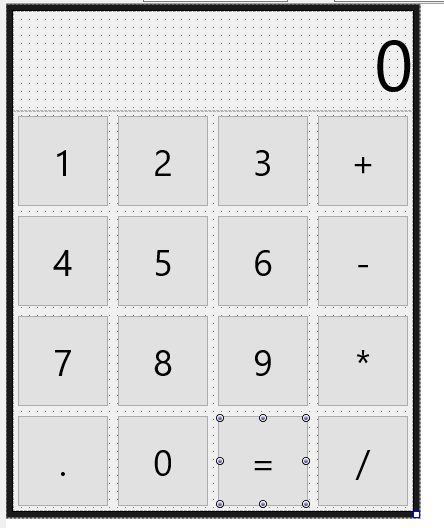
Now drop "TGridLayout" component on the form. Align it to "Client" and rename to "GridLayoutButtons". This will serve as the visual container for all our buttons. Change "ItemHeight" and "ItemWidth" to "100". Now drop "TButton" component on the grid layout. Notice that it has been placed in the top left corner of the form. Expand its "Margins" property and change all four margins – "Bottom", "Left", "Right" and "Top" to "5". Now expand "TextSettings" property and change font size to "36". Now copy this button 13 times, so we have a grid of buttons with 4 columns and 4 rows. Change "Text" property of each button, so it has the right caption. Save all. In my case the user interface looks like this:
In the next blog post we are going to write some code to turn this user interface into a working calculator app!
Next in this Series
Part 1: Introduction and Installation
Part 2: Building and Debugging in Delphi
Part 3: Architecture and Layers
Part 4: Designing User Interfaces (this blog post)


